![]() You don't need to be an 'investor' to invest in Singletrack: 6 days left: 95% of target - Find out more
You don't need to be an 'investor' to invest in Singletrack: 6 days left: 95% of target - Find out more
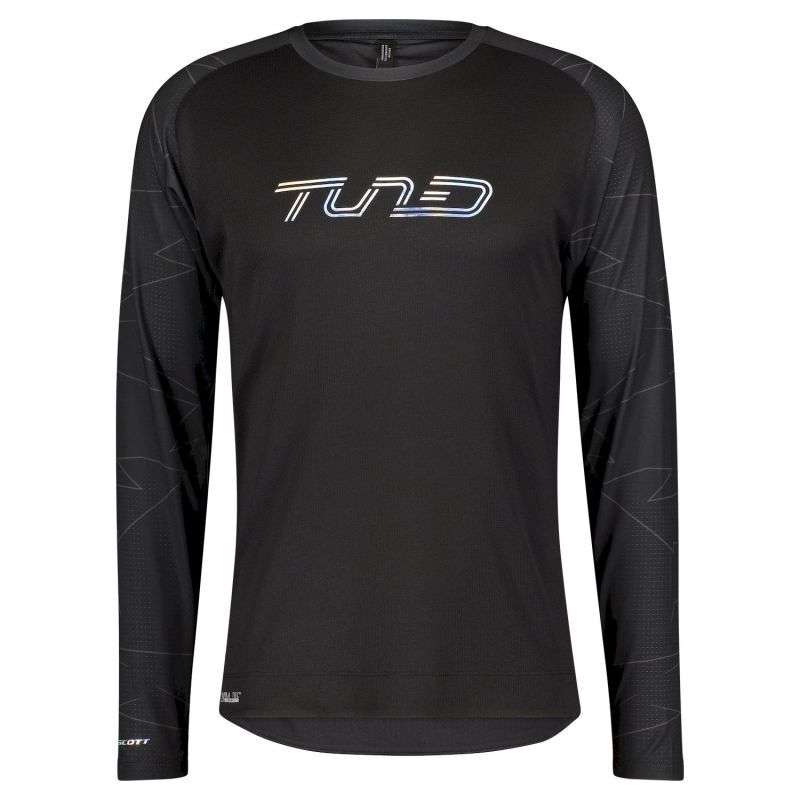
Yep, it clearly says Turd.
I had a mate who ran a hairdressers called upper cuts, and the font really made it look like a different word that started with C. Got to the point that's what everyone called it (including the owner) eventually.
TUNED, but I can see it could also be interpreted as TURD.
TUNED - horrible design though
Shame they don't have a large, quite fancy a Turd jersey.
If it says TUNED, would it say that the wearer is Tuned?
If it says TURD ...?

It looks like Turd because there is no precedent in the first 3 letters for missing the verticals, and then suddenly there is for the last 2. So, given the confusion, I go by the overall shape of the word instead and get....Turd.
If this is on the bikes as well, then that's a stinker.
Do they do it in brown?
my first impression was definitely 'turd'
although after a couple more seconds, you quickly decide that this would be unlikely, and come up with 'tuned'.
But first up, yes, 'turd'.
my first impression was definitely ‘turd’
although after a couple more seconds, you quickly decide that this would be unlikely, and come up with ‘tuned’.
Same.
Next question:
Would you wear this shirt?
TUNED.
How do you get TURD out of that?
How do you get TURD out of that?
The lowercase "n" looks like an uppercase "R", especially as the rest of the word is uppercase and the letters are all the same height.
It's also easy to miss the "E", not having an upright it looks like part of the "D".
I don't mind the font, but its the inconsistencies that cause confusion.... and then it becomes 'TURD'. I am sure this could have been done right. IANAGD obvs.... but some folk around here are so maybe an expert opinion will be forthcoming..?
Tuna
To me it says I dont want to be seen whilst riding on the road.
I never look at labels never understood why people do.
Having had a look at the site, wow Scott stuff is not cheap at RRP is it. £82 for the honour of displaying to the world that you're a turd?
Stand out from the crowd!
Yeah, no sh... oh wait actually there is. 🤣
Next question:
Would you wear this shirt?
I might, if I owned a Tuned - but probably not even then.
FWIW, I seem to recall making the same observation in the "nice looking bikes" thread.
how do you see the U as a U and not as an I if you cant spacially account for the E?
Funnies aside, its actually a great riding top. I have the non Turd version
(edit, the long sleeve one pictured, not the one linked, the sleeves make it)
Tuned but looks like turd is look really, really hard.
In seriousness, I do wonder how stuff like this ever gets signed off unless it's intentional.
I remember an old magazine stylising their name as CLiNT to avoid the obvious misinterpretation. As opposed to SFX who regularly have cover art which obscures the bottom of the F.
Turd
Tund if I look really closely.
Tuned and still can’t see turd.
Tuned. Get your minds out of the gutter people 😊
Start fitness has them heavily reduced for a reason....
If you're taking the questionable design decision to blend the e into the d, at least change the colour or make it distinct in some other way.
I worked with a colleague named CLINT. We usually wrote his name with spacing between the L and I a bit closer than normal 😊
I worked with a colleague named CLINT. We usually wrote his name with spacing between the U and I a bit closer than normal
CUINT?
CUINT
Fixed my post 😳
I saw Tuned first. Helps if you've had a passing interest in art, design, grafitti, typefaces, that kind of thing, I would guess.
To me it says throbber or richard head
CU in the NT is a crass tourism campaign for the. Northern Territory in Australia. The car stickers are very popular 🙄
I had to double check with mrs_oab - I'm sat here in my commuting Scott Tuned t-shirt.. I'm good, different font...
Do they do it in brown?
Thats worth sending them a message to ask.
If we all see it as Turd, chances are they do too.
I see Tuned or Tund. I can get how people are seeing turd but it involves changing one letter to something it's not, so I just don't see it that way.
I see "tired" but then I'm used to reading French hand writing.
I don't understand the weird judgements against this. Why the negative associations?
If I saw it on 50% off sale (edit: and there was nothing better 😂) I'd have no problem buying it, other than I'd prefer it with colour.
It's just a design. On a long sleeved top.