![]() You don't need to be an 'investor' to invest in Singletrack: 6 days left: 95% of target - Find out more
You don't need to be an 'investor' to invest in Singletrack: 6 days left: 95% of target - Find out more
The issue here then is that the desktop version of the site isn’t rendering correctly on Safari for iOS.
Desktop rendering on iOS should be an option for the user on their device, the site should display a phone friendly page version as a default (same for Android). Looks like the dynamic formatting is off and everyone is getting a mobile device topic list rather than desktop users getting a page with everything on one line for each topic.
I like a good moan about websites.................... nowt to say... well done
everyone is getting a mobile device topic list rather than desktop users getting a page with everything on one line for each topic.
Mark explained this earlier. The two-line topic list is intentional to allow space for additional features 'coming soon'.
Is there a search function in the forum?
Think it was picked up earlier in this thread but you only seem to get the Forum search function in either the Chat or Bike sections, not on the Overview one, would be good to have there too.
Oh no, the giant sliding Singletrack header is back. For a few days there it was much easier to read at work without everyone knowing how I was wasting my time.
as has already been mentioned, the lack of search function is disappointing, I dont care if there is one in each of the forums I want one in the overview and the double line nonsense is just a waste of space. It was better before.
I hope the issue I have with all the links not working at random intervals is sorted soon.
I'm happy as long as I don't get any more of those friggin' ads that kept popping up across whatever topic I was trying to read. They were peeing me off so much that I was on the point of jacking the site in.
I now have to log in twice each time I access the site.
First attempt I get the message “ An error has been encountered. Probably page was cached. Please try again.”
Second attempt works fine.
This is happening on my iMac and iPad.
the site doesn't work for me in Edge windows 10 (this is posted from chrome) every link is dead (though they come back for a microsecond with refresh).
seemed to be a problem with AdBlock (even with it paused on STW) needed to be paused on all sites then "unpaused" (though still paused on STW)
I am still having random issues with pics not showing. Im doing all rhe right steps and the same each time but some times they just don't show. See the recovery ride thread for examples. Android phone using post images direct link with duck duck go
sharkattack
Oh no, the giant sliding Singletrack header is back. For a few days there it was much easier to read at work without everyone knowing how I was wasting my time.
+1 it was a revelation when this disappeared and now it's back - very disappointing. We all know we're on STW why waste the page space?
On Chrome my process for Chrome within Taskmanager doubles the RAM used for my computer, i have 11 windows open and when i use STW forum my ram goes from 800mb to 1500mb.... so 1 tab using 50% of my ram for chrome.... yes, this one....
Without the sliding banner there is nowhere to put the hamburger menu and profile link.
I also get "unsupported browser" when trying to use Firefox instead
+1 it was a revelation when this disappeared and now it’s back – very disappointing.
Earlier on in this thread is another poster going "yay, it's back."
Guess in an ideal world it could be a profile option?
Cougar
Earlier on in this thread is another poster going “yay, it’s back.”
Guess in an ideal world it could be a profile option?
it's 2:1 against so he's wrong ;o) and yes it would be good to be an option - it was always a pain on the old forum - I don't see the "benefits" of the scrolling banner as benefits. If I want to to to profile or menu I got to the top of the page, it adds a second to the process but that banner just sitting there 100% of the time is always just taking up room (and I can't hide it at work)

An update. We are back at it squishing the inevitable bugs and paying attention to your submissions. The ads are behaving as I expected them to at this early stage. ie. there's legacy hangover from the way they were set up in the old theme and I'm working my way through those now. also, the ads system we use (Ezoic), uses a lot of AI to place ads on the page. This means not all the placement of ads is chosen by a human. The AI displays them and then learns which placements work and which don't. It takes in to account user experience - in fact I have control over the balance between user experience and revenue generation. It's currently in the default setting of 'Balanced'. It takes a couple of weeks after a big change like this to gather enough data to start optimising the placements. TLDR: Ads may show up in odd places in the next week or so. Please don't assume we've made a decision to put them there. It's probably the system 'learning'.
Oh, I approve of the new "you must be logged in" method.
I can't use the forum in Chrome. It's like there's an invisible ad over the new post box. Just now was typing something and moved the mouse to make a change, lost cursor, couldn't type. Clicked in the box and it popped open a new Chrome Tab "Subscribe" . Did it a couple of times before I switched to Edge to see if it was the same there. It isn't.
That's an odd one. It probably won't get picked up here but if you use the form at the start of this thread it will get logged in the system for a check up.
When do we get the search box back?
It's on the individual chat / bike indexes, just not the overview.
When do we get "favourites" back?
Another missing favourites. Are they gone again?
Reminder: If there's anything you are missing, wanting or a bug you've spotted, please use the form at the top of this thread to report it. All those submissions are being collated to give us a priority fix list.
I think I just spotted something. I tried to start a new forum topic but when I pressed submit it just disappeared. On re-doing it I *think* its because I didn't have a Forum selected (it defaults to "No forum").
You've fixed the "number of replies and units of time" merge on android - cheers.
All I would request is that when viewing the forum on a laptop (Chrome / W10) that a forum menu was prominent in the sliding banner, as it is on the phone.
So having used the new look on desktop (chrome w10) it looks good and seems to function fine. However the mobile view of the forum still has every thread taking 3 lines, so only 6 threads fit on a page, so it's "scroll scroll scroll" to scan down thread titles. It's quite annoying, and no better in landscape view. Chrome on Android.
Ta
Is it just me, or is there no forum search facility?
I can only see the main one at the top, which only returns articles from the main site.
Is it just me, or is there no forum search facility?
Go into Bike or Chat and another search box is available. That's the one you want
Just to be clear. That’s a bug. Search is coming back in the overview forum.
Go into Bike or Chat and another search box is available. That’s the one you want
Cheers.
I usually just scan the first couple of pages in Overview
I know I'm late to the party and no doubt this might have been asked earlier, but why do we have the forum indexes as have the chat / bikes and not bikes / chat? You know, just like they've been historically.
Is there a way to search the Forum? I can see the main site search.
The same way it's been suggested 17 times on this thread already including two posts before yours? 😁
^ best to use google and specify the site. For example if you want to search for the words frozen sausage type into the google search box
site:singletrackworld.com Frozen sausage
The video ads are killing my old iPad. Makes it super slow and had to write posts. Yes it’s this forum, no other sites cause this issue, and other forums / sites perform fine
Most browsers allow you to disable autoplay on videos.
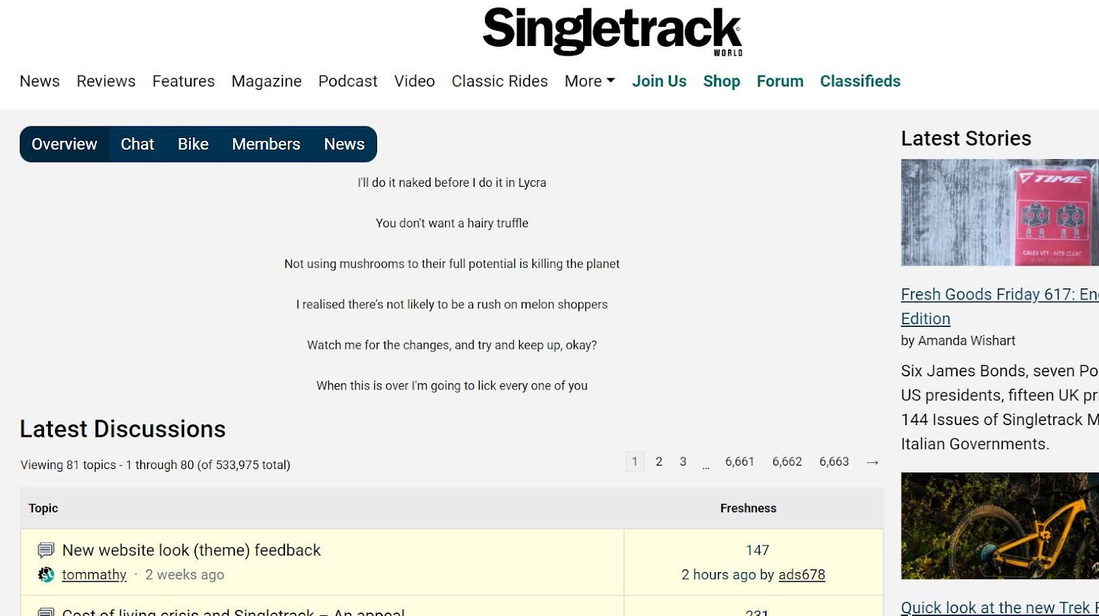
OK @tomathy - what was happening with the weird "slogans" under the posts? Don't think I didn't see them, especially the one abour rather being naked than wear lycra! They reminded me of the spline text from the printed magazine.
They were/are indeed the spinelines from the last few issues.
[url= https://i.postimg.cc/zBtxhK8G/Screenshot-20220906-081736.pn g" target="_blank">https://i.postimg.cc/zBtxhK8G/Screenshot-20220906-081736.pn g"/> [/img][/url]
And they're back!
Hamburger menu does nothing except turn the screen grey on Safari Version 15.6.1 (15613.3.9.1.16, 15613) on my Mac 🙁
Hamburger menu
On Windows I don't have a hamburger menu.
You will if you shrink the browser width below 1000px.
Safari 15.6.1 here and I'm not able to replicate that. Post it in the OP form and Tom will add it to the list
I'm running Catalina, which might be the issue. This is the most up to date update for that OS based on the recent breach.
Those Spline Texts are now ALL popping up on a screen refresh of the forum contents list. They flash up, then disappear leaving only one. As a result the screen contents are jumping around.
Android 13/Chrome
It might already have been said - but can you please make the giant "Singletrack" at the top of the page disappear when scrolling down? It's very visible from a distance in an open office, people might realise what's going on.
That's a contentious one. When we launched it wasn't fixed. There were a lot of voices asking for it back to help with navigation.
It's been mentioned several times on this thread, probably 50:50 between people wanting it gone and others glad it's back.
Can you have it so that it disappears when you scroll down and drops back in if you scroll up a little, perhaps? Or have it as a profile option? (FWIW I couldn't care less either way, personally)
I just noticed that my username now has capital letters.
Cool.
EDIT: Actually scratch that. It did display it with capitals on the Starling Marmite promoted thread. But not on this one. ???????
EDIT2: Hmmm, on the forum no capitals, on an article with comments below, capitals. More Gremlins.
Never mind, doesn’t really matter anyway.
That's presumably account name vs display name again. You can set the latter in your profile.
Cougar.
Not able to change username, it’s greyed out.
Oh yeah, so it is.
Reporting, sorry if it’s been done, but I’ve just tried to add a website link into a forum post, the Link button pops up the window but there’s no text in it. Trial and error trying to add the correct bits in the correct boxes.
iPhone running Safari on iOS 14.8.1 was OK before the update to the forum.
I think that's a dark theme issue - the text is there, it's just white on a white background. You can see it if you drag-highlight the background (how you do that on an iDevice I don't know).
Light theme may be similarly affected, I haven't checked and don't care sufficiently to test it.
That’s a contentious one. When we launched it wasn’t fixed. There were a lot of voices asking for it back to help with navigation
I still 'long' for the Overview button we used to have at the bottom of the thread text.
Simple. Perfect.
I wonder why it went nearly every time I reach my right hand right across the screen I'm viewing to the top left corner to open a menu, then reach across to the bottom left to hit Forum, which is, you know, a hundred times.
I'm always confused as to why I seem to be the only one around here who finds that unnecessarily convoluted and ergonomically unsettling 🤔
Most seem to hit the back button, which doesn't take you to a refreshed overview but a cached one, or happily scroll all the way up every time, fingers like a cartoon character starting a dash 😂
But yeah, at least there is a burger menu now, albeit in an unintuitive place. It used to be accessed on the right which at least meant that you weren't reaching across the screen (if you hold your device in your left hand) but now it's disappeared and gone to the left.
Funny old world.
I still ‘long’ for the Overview button we used to have at the bottom of the thread text.
Simple. Perfect.
Me too.would love to know why it went
Me too.would love to know why it went
I imagine it's because they want you to see that there are other places to navigate to other than just the forum each time you move.
Fair enough, but still annoying 😐
The previous version forum used to let you know you had a DM on the front page, but with this new one you have to specifcally go into the your profile to see if there are any messages. Maybe the little 'my account' symbol at the tp could get a small red dot or something if you have unread messages??
I'm with Kayak23 on the link straght back to forum overview from the bottom of the thread. There was at one point a "back to top" button that hoverred on the thread page, but that also went.
It does feel like a deliberate attempt to make the forum harder to use.
Also, teh "Classifieds" link from teh hamburger menu is off teh bottom of teh page on my mobile - effectively hiding teh classifieds from view, so if you are not familiar/aware of them already, you'd never know they existed. Given that teh classifieds has been recently monetised (thought boosted ads), I'd have thought SWT would want to have this more obvious?
Simply putting the bold/green links in the hamburger menu at the top of teh list (rather than the bottom) would make both these situations better.
I would guess - and it is a guess - that these are customisations which get overwritten when a new theme is installed. Ie rather than something being intentionally removed it just hasn't been reimplemented yet.
. Ie rather than something being intentionally removed it just hasn’t been reimplemented yet.
Not sure. I mean it's been several years I think since the Overview button that used to be at the bottom of a thread went missing after an update. I've been moaning about it ever since! 😂
Since then we've only been able to navigate back to Overview by opening the floating banner hamburger menu, which opened a side banner with a speech bubble symbol which you tapped to take you to overview.
Or, clearly what a lot of people do, hit back and get a cached page or scroll all the way back to the top to get the overview button.
Feels intentional to me, but Mark or anyone else never comments on it.
Obviously it's not the end of the world, but why not have something incredibly easy to implement that makes navigation so much easier?
Don't know...
Nor I.
One thing I think is great on another forum I use, is a button that takes you to the last post you read on a thread. I have no idea how easy/costly this is to implement, cracking feature though. Can you even get to the last post in a thread yet on here?
Those Spline Texts are now ALL popping up on a screen refresh of the forum contents list. They flash up, then disappear leaving only one. As a result the screen contents are jumping around.
Agreed this is painful. They're animated by some javascript that runs after the page loads. Developer needs to run the site with javascript switched off, and put some CSS on the block that makes it the same height as it would be once the script has run.
FYI I'm getting an (unobtrusive) advert - below the big white posting box I'm writing in and above the Facebook/Twitter etc links.
It's a banner advert for <scrolls down a bit> Ezoic and ironically is suggesting how to "Increase your site revenue". Maybe we should all click on it? 💩
That's just the provider we use for our ad system. It's a static image. We get a commission if anyone signs their website up to them 🙂
ahhh adds for people paying to remove the adds. great.
Dark mode only available on mobile for me. on chrome the site is definitely white?
ahhh adds for people paying to remove the adds. great.
Ahh, come on now - it's tiny, unanimated and I'm not even sure how long it's been there for it's that unnoticeable. Give them a pass on this, surely 🙂
Andy doesn't give passes. Not to us anyway
Survey thread broken. Can't read page two.
Is there a search? I can't seem to find it.
Andy doesn’t give passes. Not to us anyway
Yup no one gets a pass im afraid. You know those really evil grumpy old bastards, thats me 🙂
Honestly, it's a sh1t show. It's awful.
I get the Privacy & Transparency menu pop up on almost every new page which just makes the site unbearable.
Also, you claim to have opened up the review section to everyone... you haven't, or at lest not me.
I find I'm spending less and less time on the site.
Is anyone else finding that? Add that to your poll section.
I get the Privacy & Transparency menu pop up on almost every new page which just makes the site unbearable.
So what are you doing differently from everyone else who doesn't?