![]() You don't need to be an 'investor' to invest in Singletrack: 6 days left: 95% of target - Find out more
You don't need to be an 'investor' to invest in Singletrack: 6 days left: 95% of target - Find out more

https://www.bbc.co.uk/news/entertainment-arts-67105475
Hmmm... What are your thoughts on this place? Now im very keen on older style buildings in fairness but this place reminds me more of the 1950's crematorium in our town, not a place to spend some relaxed, happy years in the twilight of life.
It's easy to make a snap judgement based on the aesthetics, but I suspect the panel's criteria was a bit more sophisticated.
Things like this may have been more important:
It offers residents a variety of facilities such as an art room, a hair salon, nail bar and events space aimed at encouraging social interactions. This in turn supports healthier and longer lives.
This building provides comfort and warmth, with thoughtful features designed to prevent isolation.
Design features to meet the different needs and abilities of elderly residents include concealed wooden handrails and built-in seating along walkways. High-contrast patterns on the edges of floors help those living with dementia a visual way to navigate the building.
It's staggering how often we get these things totally wrong.
At least it’s a brick external finish, which gives it a more varied colour and texture, especially with the pierced brick panels - I’m wondering if there are actually windows behind them, to allow more light in without being too bright. It makes me think of 1930’s Art Deco, there are a lot of blocks of flats in London with similar styles. So much better than bland concrete.
As reeksy says, its what it gives its residents that’s the most important thing, I doubt many of them are too fussed about the exterior design.
Much more important with these buildings is how they work for the residents not what they look like. The few pics available do not make me feel confident it will be good. a wooden clad communal area will possibly have rubbish accoustics and the use of "high contrast patterns on the edge of floors" can be problematic - I have seen this done really badly. Have they used folk who are expert in dementia friendly buildings?
Courtyard layout is fabulous. I have worked in a home with this layout and its very good
reminds me more of the 1950’s crematorium in our town
Thought exactly the same as soon as I saw it!
Looks like something someone built in Minecraft
TJ makes a very good point about accousics. It's astonishing really how little they are taken into consideration in building design and if they are you have to assume by people who know nothing about them!
Impossible to tell from the photos but I looked at the cafe and my first thought was I wonder what that's like to have a conversation in when it's busy and most of the people are at a stage of life when their hearing has inevitably deteriorated.
Visually though I quite like it. A 50's - 60's feel and built with materials that hopefully will age well
I assume the awards panel know what they are doing, as well as the architects themselves, and the concerns about acoustics, etc. are not issues. Otherwise the architect has failed. But yeah, non-architect has seen some pictures and is not confident.
The FAB at Warwick Uni is my daughter's home faculty, and having been in that and seen how that works, if the John Morden centre is better than that it'll be a spectacularly good building. First time I went in there it was jaw droppingly impressive.
but this place reminds me more of the 1950’s crematorium
Not just me then! Ultimately a buildings "success" is how it works for the users though.
Good point about the acoustics, having worked in an award winning office with appalling acoustics. You couldn’t hear a word the person next to you was saying, but could clearly hear what Susan and Brenda thought of last nights Eastenders from 4 banks of desks away!
The retirees living in it will be reminded of their youth when the avant garde buildings of the time looked like this. No bad thing to me.
theotherjonv - you would be amazed at how many buildings I have seen supposedly designed to be dementia friendly that are not
For example the point about contrasts at floor edges. Good for folk with limited eyesight. Bad for folk with dementia as they see the colour contrast as a step and thus often trip on them. Plain floors are advised for dementia friendly places with no colour contrasts at edges and doorways
I actually studied dementia friendly building design with the dementia studies centre at Stirling university.
Bunnyhop
Full MemberAesthetically not pleasing or appealing to the eye.
Yes, it's not a looker is it!
I was reading the the architect's website, i like this bit:
Morden College is a Grade I listed almshouse in Blackheath, London founded in 1695 by Sir John Morden and built by Sir Christopher Wren’s master builder and successor, Edward Strong. The new building makes reference to the historic architecture in its colonnade, roofscape and brickwork.
It makes such a good reference to it, that you can barely tell them apart.
John Morden Centre:
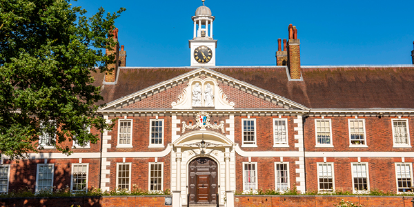
Morden College:

Could they not have tried a little bit harder to make it look not shit?
My father was in a purpose built retirement/ care home up until his death, my mother is currently in one which is a converted office block on a main road.
The converted office block is by far the nicer place because it has sufficient staff who aren’t stressed to **** and can actually spend time with the residents. Grand design may be great but if there isn’t an investment in care staff it won’t make much difference imho and this country is so shit at present care for the elderly is terrible. <br /><br />TLDR nice box but what are the contents like?
If anyone fancies getting into a care home I can recommend the Plenus home in Lisbon.
Do you think they got the residents to rummage down the back of the sofa / ask family / go on only fans to find the extra cash after the marble kitchen and bathroom pushed it over budget?
Could they not have tried a little bit harder to make it look not shit?
Builders in the late restoration bow to no one* in their love for additional do-dads, flim-flam and frippery. Mostly becasue they could pay Mr Smith the Do-dad maker tuppence ha'penny for "exceeding neatly" from his catalogue or London Studio, and order him be-gone lest you trouble him with a firm hand to the side of his head, by God.
Now-a-days not so much.
*Except maybe the Victorians who went for turrets and flags in a really big way
I like it at a glance, but i'm a sucker for 50s/60s civic architecture when its done well. Key is does it work for its users, will it be loved....how longs it been open? We won't know if it works well for a few years, so judging the functionality is a bit tricky. I think architecture awards should be awarded once a building has proved its worth.
so judging the functionality is a bit tricky
And when has that ever stopped anyone from voicing their opinion on anything?
But yeah, non-architect has seen some pictures and is not confident.
No just someone who's been putting pa's in venues all over the world for 28 years. ☺️
Canteens are always the worst and add the height and it's can get very tricky. Hard to see from the photos if there is anything in to mitigate it, certainly nothing obvious. The top prize for terrible accoustics though goes to the Guinea factory in Dublin
Love the aesthetics of the building though.
nickc
Builders in the late restoration bow to no one* in their love for additional do-dads, flim-flam and frippery. Mostly becasue they could pay Mr Smith the Do-dad maker tuppence ha’penny for “exceeding neatly” from his catalogue or London Studio, and order him be-gone lest you trouble him with a firm hand to the side of his head, by God.
Now-a-days not so much.
Well you don't need frippery to make it aesthetically pleasing. Simple balanced shapes can be very pleasing to the eye. Obviously the skill of the architects is making a usable space that meets all the requirements and still making it look pleasant.
Modern buildings are often dripping with frippery, it's just really ugly challenging & carbon neutral frippery. E.g. multi-coloured plastic cladding, wonky shaped glasswork, strange unsymmetrical bits jutting out and so on.
Example:
![]()
Modern buildings in general though are dripping with frippery
That image has literally got nothing on it that you could accurately describe as frippery, that 's just been built without the aide of a spirit level. I mean look at this...
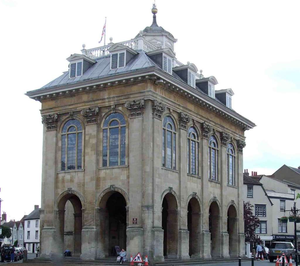
It's Abingdon Town Hall, does that Preston Station out-house have columns? Turrets? Flags? pointless balconies -with additional ball shaped do-daddery that are inaccessible to anyone and fake windows, all topped of with a mini tower built on top of existing tower?
No sir, It does not...
I like it. The Flemish Bond is a nice touch! Worried about the acoustics though, especially as they've laid rugs under the tables, presumably in an attempt to do something about it...
nickc
That image has literally got nothing on it that you could accurately describe as frippery, that ‘s just been built without the aide of a spirit level. I mean look at this…
Oh I see, my mistake, I guess then it means kind of 'fussiness'. I was under the impression the word frippery just meant unnecessary, non-structural architectural decoration in general. So for example the building I posted above could have been constructed straight, and symmetrical, the wonkiness is purely an aesthetic embellishment.
I was under the impression the word frippery just meant unnecessary, non-structural architectural decoration in general
I think you could be right anyway, folks seem to hate "modern buildings" and always seem to go for the sorts of stuff that was built sometime between [waves hands] 1690-1820 [/waves hands]...ish. Go to any NT or historic building and you will overhear some arse say "why can't we make building look like this anymore" to which the answer is obviously; 1. no one apart from boomers with no imagination wants to live an permanent state of historical make-believe, and 2. It would cost a squillion pounds. and 3 Boomers in the late restoration still complained about the fact that everything was getting overly fussy, and could everyone have less fun when they're having sex please?
Boomers...tsch.
Hmmm… What are your thoughts on this place?
It's certainly a building made of bricks. The outside looks gash*. Inside looks quite nice.
I think I prefer it to the Preston Train Station Sculpture.
* from the angle in the OP. I might reconsider if I'd seen it in the flesh.
It makes me think of 1930’s Art Deco
I'm not sure I get Art Deco from it. It's 1950s modernist all over. Some 1950s stuff looks amazing.
No just someone who’s been putting pa’s in venues all over the world for 28 years.
The perils of the written word and apologies to you and TJ - I was referring to myself. I would LIKE TO assume that the architects and panel know what they're doing, but looking at the pictures I (a non-architect) am not holding my breath.
I think it looks quite good. Certainly better than that Morden College place, which is very dull.