![]() You don't need to be an 'investor' to invest in Singletrack: 6 days left: 95% of target - Find out more
You don't need to be an 'investor' to invest in Singletrack: 6 days left: 95% of target - Find out more
Yes, a lot of the requests here would improve the UX of course, but they aren’t necessary.
Maybe they are to the users...
Seems like I'm the only person here in agreement with @cougar.
It'd be nice if we could all post constructive criticism rather than, ya know, unconstructive criticism.
I hate most new generations of car when they come out. Until I'm used to them, at which point I think how outdated the old models look.
Towers are doing a tough job and it's a bold move. I'm all for it personally.
Some A/B testing may not have gone amiss by the sounds of it. But simple 'I hate it'/'I preferred it when me magazine got dropped off wi' me loaf of 'Ovis' posts don't really help anyone.
For the powers that be, may I suggest a quick survey after a fortnight, focusing on the new look and functionality and how they've been received?
Then at least you can start to refine focus and quantify.
I’m most astonished at how many people don’t know how to use a Web browser in 2022.
I'm heartened to know that this particular site feature (any issues with the forum are the fault of the users) hasn't been lost 😀
PS I couldn't post a reply on my mac (Chrome browser), as the reply box is dead/not clickable-on. Opened up site on mobile, navigated back to thread. Scroll to bottom to reply. 'you must be logged in to reply'. Ok cool, I guess that's a link to the login page? Nope? Where is it then? Ah, back at the top. And once I log in, I'm directed to my profile. And now I have to go back to the homepage to find the thread again, or just swipe back, except I can't because now the page is a massive uncancellable advert and...
Does anyone who builds the forum ever actually try using it?
Can we have a game of 'show us your forum'?
Bonus points for those who are attempting to improve things for their users in tough times.
Negative points for those who believe they can do a better job. Or just can't seem to express anything in a constructive manner.
Works fine here. The problem is that this place is chock full of grumpy middle aged men. Change is not something embraced by this demographic.
I like the contrast, makes it easier too read.
Too many colours in the main page and the reply/report need a better contrasting colour too.
Being from Yorkshire and a 50 year old grumpy git, I don't handle change well.
However I like the new look on my laptop. Seems cleaner and sharper.
Iphone forum takes a bit of time to love, but it is growing on me.
Well done STW for having the notion of change, it can't be an easy decision to rock the boats of grumpy old (and not so old) men 😉
Works fine for me on Chrome using an iPhone in portrait.
I like it. Easy to use, easy to navigate. Very clear.
Far easier to read on an iPhone. Especially for an old fella
Thumbs up
Works fine here. The
Good for you. Says an OAP here who's doing his best to get his ancient head around it.
Sorry for being thick. 🙄
I think broadly speaking it looks good, particularly on mobile.
A couple of (hopefully) constructive points:
- It seems harder to navigate back to the overview - the 'back' button or a swipe takes me to an old cached overview.
- The font works great on mobile but hurts my eyes a bit on desktop. Maybe it's something to do with contrast or something but I really can't look at it for long.
Clear layout, easy to read, seems more responsive on my phone. What's not to like?
I hate most new generations of car when they come out. Until I’m used to them, at which point I think how outdated the old models look.
I get your point. I'm an advocate for change, for evolution, for improvements. Certainly like a fresh visual take on something.
Not trying to be 'unconstrictive' as I think the people at stw are fantastic and put up with a lot of moaning, and here's the but.
But, removing basic functionality isn't really an advance, no matter how you dress it up or what analogy you use.
What if your new car had 6 gears and a fresh new colour, but they'd inexplicably removed the gearstick in the updated model? 😉
Someone moved the furniture whilst I was at work. Hopefully there won't be any stubbed toes in my near future. On the plus side two zoom-in operations mean I can read the overview page without reading glasses while my contacts are in. A boon for the older long-sighted man.
Overall, I like it. Couple of accessibility issues with my web-head on (and trying to be constructive!)

The almost black on dark gray is way below an acceptable contrast ratio. Webaim (who look to maximise web accessiblity) shows this combination as
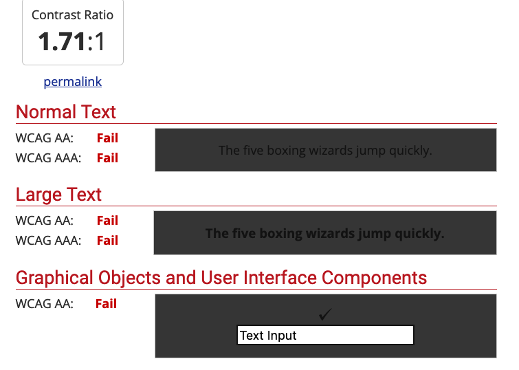
Contrast ratios should be > 4.5:1 for normal text.
Similarly, the 'active page' indicator does have much contrast between the active page and the rest. I've not been using this long but have already had trouble working out where I am in a thread.

Sorry for being thick. 🙄
Not thick at all. Just old 😉
Not thick at all. Just old 😉
Yep, qualified for my state pension on 22nd August.
Good luck, hope you make it. 😂
I love the new look. No contrast issues for me… looks nothing like JCA says above.
I also like it when things like this change as it keeps my brain active reinterpreting the screen.
No contrast issues for me… looks nothing like JCA says above
Yup, same here
It's bare bones in here 😕 How about some pictures for the walls.
And the Bike Chat toolbar links have become Chat Bike toolbar links. They're the wrong way about.
How bout removing sold ads that have been repulsive for the last 2 months.
🤣
I think the quality of input on all threads has increased enormously since lunchtime,I even got the search button to work. So way,and indeed hey for this bold new world 👍 😆
No work in Firefox, can't open threads.
Works in FF for me, iOS and PC.
Good luck, hope you make it. 😂
Doubt there will be one by the time I get there 🙁
I just created a new thread which was a cathartic rant about full kit ****ers but it seems to have disappeared/never been there.
Are others able to start threads or is this a new policy to reduce arguments?
The new AI decides which content is allowed.
It doesn’t like starting on my iPad in landscape, need to rotate to portrait then back to landscape and it seems to work better, I’m not a fan so far.
It will a take a little time to get used to it, but its nice to see space between all the threads, easier to read and glance through them.
Change is always good IMO 🙂
2 bits I miss - while on a laptop - the ability to click on the last post in a thread (recognising this wasn't possible on a phone or tablet before), and the wee icon top left that took you back to the forum front page, without needing to use the back arrow
I'm fine with the change, dark mode on desktop and phone are clear and legible. One bug report though - there's a "More" button in the banner at the top (under the hamburger on mobile), clicking that on the overview page gives a dropdown but on this page it does nothing (on both desktop and mobile).
Randomly I just switched radioscotland on and heard “chipps editor from Singletrackworld” said by presenter. The new forum style so bad it’s made bbc news perhaps?
(No idea what the STW reference was)
I like the overall look, cleaner and more modern IMHO
BUT various aspects are counter-intuitive. If I'm not logged in and see a post that I want to reply to then I have to go to the top of the page to login, which takes me to my profile, which isn't where I want to be. Please add a Reply/Report link to each post whether logged in or not, if you're not logged in it takes you there and then back to the Reply To: field once logged in.
Logging out? Back to the top, profile, settings, logout. Why? (the sequence might not be 100% because you can't click on your profile to check if you're in the middle of a post) A simple logout button would do
I can't see whether I'm logged in or not at the top
Search? Forget it. I wanted the joke thread, entered "joke" (no inverted commas) and just got magazine pages without thread options
Search? Forget it. I wanted the joke thread, entered “joke” (no inverted commas) and just got magazine pages without thread options
From Mark's [url= https://singletrackmag.com/wp-content/uploads/2022/08/cost-of-living-crisis-and-singletrack-an-appeal/ ]Recent Post[/url]
First of all, there’s a new look to the website coming. The decorators are in and in the next few weeks we will be launching the new site theme. We hope you are going to like it – it will organise our content better and make it easier to find stuff.
Then come some technical developments including fixing the site search, some nice new features for everyone and a bunch of full members only benefits and very useful products.
Search was more functional before this change, albeit you could only get one page of thread results
The overview page doesn’t refresh if you simply go back.
Does on an iPhone…
Too many lines and too much text on the forum list. It makes it much too hard to scan.
The thread pages are ok though.
This..... The Chat or Bike forum front page looks awful.
Much preferred the previous style. I don't care who started the thread or even when. Too much info that is unnecessary.
Hi all,
Would people be happy in answering a few of these questions so we can see how people are using the site and just get a better understanding of how people are taking the new theme of the website.
[forminator_form id="12516949"]
What areas of the site do you think require more improvements
Think there's a word missing there? Just to make sure I'm answering in the correct way - I was about to tick most of the options to say they are improved but I think you're meaning if these areas need more improvements. 🙂
It all seems ok to me, my only thought would be whether each thread heading in the forum could be squeezed a little bit tighter. I only ever use my phone and I can o KY see 8 threads on a page so it's not as easy to quickly scan the forum
Huh, just tried the back button on my desktop browser to find it does indeed load a refreshed overview instead of the cached version. If you clicked away from the middle of the threads list, it does return you back there and not to the top of the page however.
edit - ah, but of course if you've looked at more than once page of a thread, multiple clicks needed to get back to the overview. So sorry, we definitely need that fly-down navigation bar back. Thanks.
^^^
Wouldn't it be better if that survey had it's own locked thread? It'll get lost very quickly.
Wouldn’t it be better if that survey had it’s own locked thread? It’ll get lost very quickly.
Yes, absolutely. It's already fallen off the last page of this one.
@the-muffin-man Good idea. I have created a new sticky thread for this so it is in both places.
https://singletrackmag.com/forum/topic/new-website-look-theme-feedback/
@tommathy, hope nobody at STW towers is too disheartened. Overall - with the exception of the forum index of topics now being multi-line and taking up a LOT of space to show topic titles, with (IMO) more info than is strictly necessary - I think the overall changes are an improvement. I see your comment above about being in preparation for features yet to come, so obviously there's more to it. Having an option to make it 'compact' in the same way Gmail inboxes can be tweaked would be good.
Yes, I've submitted that in a reply to the survey too.
Difficult for some, me included, not to focus in on one particular change they don't like when overall the changes are an improvement.
Completed the survey. Just the forum index with multiple lines per topic. At one line per topic, rapid browsing is much easier and topics won't fall off the bottom quite so fast. That was the beauty - bike or not bike, scan down to read something. The rest is fine. Oh and my MacBook never logs me out, but my phone does all the time. Might be related to still being logged in on the laptop. This was not an issue until recently.
Other changes are an improvement.
How bout removing sold ads that have been repulsive for the last 2 months.
Oh please please please, this ... !!!
I like, and use, the Classifieds a lot. But it is getting increasingly tiresome scrolling though a bunch of sold adverts, which now, usually take up the first page of listings. There is no real benefit to anyone keeping 'sold' listing visible.
Would also be good to easily distinguish between the boosted Ads (some of which seem to have been there for months), and the newly posted non-boosted Ads.
Cheers.
Generally like the new look, its a bit cleaner somehow and text bigger (or at least seems that way).
Two things:
Logging in to treply to a thread is not vey neat, once loged in you the have to return to the forum then search for the thread again. A button a the bottom of the thread to loging then return you to that same point would be really useful.
Other thing, i used to like the number of pages in a thread displayed.
Other that that all good👍
its broken the links dont work
Has the forum search been mentioned (I’m yet to read the whole thread)
The homepage looks like a forum from twenty years ago! Fortunately, opening a thread shows that at least that part hasn’t been messed up, but honestly, there was nothing wrong with the way the forum looks, and as a wise man once said, “If it ain’t broke, don’t **** with it!”