![]() You don't need to be an 'investor' to invest in Singletrack: 6 days left: 95% of target - Find out more
You don't need to be an 'investor' to invest in Singletrack: 6 days left: 95% of target - Find out more
I need to print this out for a child...
It came as a PDF but the PDF was just this image.
Is there a way to remove the blue background? I can't just swap blue with white because that makes the white text invisible.
This is just the latest of these so no help needed converting this specific one. It's a general technique I'm after.
Do you have MS Word ?
If so, try opening the file in Word and then it may let you remove the background.
Best I can do with Paint and MS Word in a few seconds is copy the image to paint, invert colours (right click and at the bottom of the list) then copy the new image to word and increase brightness + 40% and contrast to +40%
Adobe Pro would probably be able to do it, it wont be a 'flat' file.
Best I can do with Paint and MS Word in a few seconds is copy the image to paint, invert colours (right click and at the bottom of the list) then copy the new image to word and increase brightness + 40% and contrast to +40%
@oliverracing That's brilliant thank you. The 'invert colours' step is really helpful.
It might be faster just to recreate it in word, re-type the lists in a few textboxes!
Ilovepdf.com let's you convert to alternative formats, eg convert PDF to word and various other formats.
It might struggle or mangle the images completely, but handy site when you're trying to extract things from pdfs.
how are you intending to print it then? Onto white paper presumably? What is the actual goal here, just reduce the overall amount of ink used? What software if any do you have access to?I can’t just swap blue with white because that makes the white text invisible.
1) Go back to the source and ask if they have a better copy.
2) Load it into (say) Paint.NET and use the Fill function. Fill the white text in black and the blue background in white.
It'll be ugly as sin but it'll save your ink.
3) This:
It might be faster just to recreate it in word, re-type the lists in a few textboxes!
4) Just print it in blue, who cares?
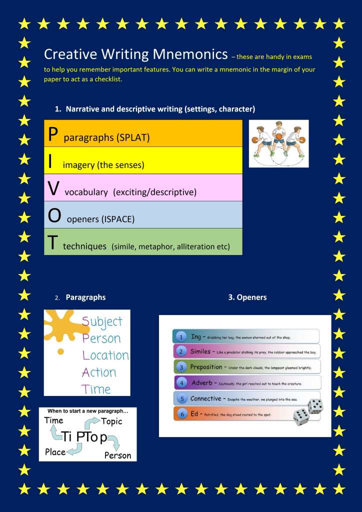
5) Come up with something less shit. ISPACE? That's bloody awful, those things don't belong with each other. And two of the main acronyms are further acronyms.
Print it out at work!
Or maybe in greyscale?
"snip" shift/window/s the text boxes out and paste them into a blank document.
The more I look at this, the worse it becomes.
The T in PIVOT is "Techniques" which (aside from being as woolly as Shaun) lists "simile" as an example technique. Yet simile is the S in your ISPACE which is in the O of Openers. I'm confused just typing that and I haven't been a child for some time now.
The trailing P in tiptop should be capitalised or it makes no sense.
It's an absolute car crash crime against font usage.
WTF is the basketballer all about?
I'd bin it and start again if I were you. It's a couple of lists and a couple of arrows, you could have rewritten it in the time taken to create this thread.
Print it out at work!
is the correct answer here. 🫣
He's not, if he's pivoted twice on different feet then he's travelling.
On chrome there are some add ons for the browser that let you choose what to print. not sure if it works for PDF but it lets you chop out all the images and legal guff from emails and web pages
how are you intending to print it then? Onto white paper presumably?
Yes onto white paper.
What is the actual goal here, just reduce the overall amount of ink used?
Yes that's the only goal.
What software if any do you have access to?
MS Word. Paint. I've a Windows laptop and an Android phone.
“snip” shift/window/s the text boxes out and paste them into a blank document.
Thanks. I ended up doing that along with oliverracing's invert suggestion.
I’d bin it and start again if I were you. It’s a couple of lists and a couple of arrows, you could have rewritten it in the time taken to create this thread.
They get loads of rubbish like this. I'm not re-writing each one. Just hoping for some way to cut down on the ink. The thread has already helped me so worth the time for me :-).
On chrome there are some add ons for the browser that let you choose what to print.
In this case it was just a single image so can't block different elements.
The trailing P in tiptop should be capitalised or it makes no sense.
@cougar You're wasting your talents in IT - you should jack it in and become a teacher. I believe the pay's good and they get lots of free time / holidays. /s
This isn't the answer, but, HP Smart subscription printers charge by page, whether it's a black dot or a whole sheet of colour. Really wasteful obviously but it means it's not your waste, at least.
Hp smart subscription printers really are the answer. If you only print that single page you will probably waste more ink in the cleaning cycle of the printer than you actually save by messing around :(. the HP smart stuff solves that and the printers can be very cheap
As a teacher and sometime crayoner, poor design / lack of care in the creation of school resources really bugs me.
It's not difficult - K I S S and avoid all the pointless decoration and irrelevant dual coding.
Not had loads of time to do this, but the school is welcome to this (I'm only a lowly art teacher, so no comment on the actual content).
You’re wasting your talents in IT – you should jack it in and become a teacher. I believe the pay’s good and they get lots of free time / holidays. /s
I've dated two teachers and my current partner was a TA up until recently. I am painfully aware of how much pay and free time they get. So as I'm sure you'll no doubt expect: two words, second word "That."
Invest in a moderately priced laser printer. One of the best £200 I ever spent to get away from inkjets for ever.
Windows Snipping Tool would allow you to snip the pictures out of the PDF and ypu could then paste them into a Word doc and add the text at the top
This is just the latest of these so no help needed converting this specific one. It’s a general technique I’m after.
Ask the school to stop using such ink wasteful backgrounds.
By doing that you only have to fix it once, and as a bonus you fix it for everyone else too.
@colournoise That's fab thank you.
Since you have Paint & apparently that does layers now, I'd copy everything that needs the blue background (i.e. would be unreadable/look weird without it) to the top layer (deleting everything else) and then on the bottom layer remove the blue colour (think you said you knew how to do this?) leaving you with something like:
which is low-effort, uses less ink, and still (as!) readable.
at the level where the pupil knows what metaphors, imagery and alliteration are: get them to recreate it themselves! They’ll learn more doing that than the document contains! Especially if they type the words rather than snip them.
FWIW I am 100% with Cougar here. Someone needs to make educators (and it’s not just teachers, this shit happens with university lecturers, commercial trainers etc) STOP making up mnemonics just because they can. These things might even be useful reminders for the teacher delivering a lesson but no kid in a creative writing exam has been struggling and solved it by remembering pivot-Ispace-tiptop-splat!
mnemonics are very useful if you have to remember the order to do something, or where they help you check a list of things is not missing anything, but learning that creative writing should have paragraphs, vocabulary and techniques is a bit like saying maths should have symbols and numbers!
The styling says primary school (although the content might be early secondary?). Which 10-14 yr old is going to learn 22 letter mnemonics, with 5 p’s, 4 t’s, 3 i’s etc!
Trying to remember mnemonics for me is no easier than trying to remember what the mnemonics are trying to help me remember! I think there’s only one, which was ROY G BIV - the order of colours in the spectrum, but I can remember them without the mnemonic anyway. I can also remember the order of the planets in the solar system, including Pluto, and I don’t give a toss what some smartass astrophysicist says! Don’t ask me the names of moons or Kuiper Belt objects though… 🤣
I got Roy G. Biv from the Whizkids' Handbook.
My general approach to mnemonics is it's often arse-about-face. Like, if you need a catchy aide memoire then you don't actually understand what you're trying to remember.
Take PCMCIA. The mnemonic is "people can't memorise computer industry acronyms." Is that any easier than PC = personal computer, MC = memory card, IA = international association? And what have we gained here anyway beyond a point on a CompTIA exam, it's a memory card.
A music stave, "Every Good Boy Deserves Favours" on the lines and FACE in the gaps... or as I realised years after being taught this at junior school, it's just the damn alphabet. EFGABCDEF.
My former apprentices told me an immediately forgettable mnemonic for memorising the OSI 7-layer model. Great, but... if you understand what those layers mean then you don't need to memorise anything because you can work it out. If you don't then what's the point in memorising it at all. What's at one end? Wires, so that's Physical. What's at the other? Outlook, so that's Application. Now fill in the gaps.
That is a crime against design and education.
The former is avoidable and unforgivable. The latter only forgivable if the purpose is to prepare someone for a test on lists of (listed) terms rather than writing.
All the features described in the lists can comfortably be learned and consistently applied by practice. Thereby creating a habit and ensuring folks follow the guidance. Once consistency and understanding are achieved they can then break the rules as they see fit.
Impressed by the speedy options provided by STWers though.
And I’d also say the answer was use an HP Printsmart printer.
I've just realised, the tiptop thing is "who, what, where, why," the mnemonic for which is "W."
(... and who the hell says "tip top" anyway? Is the child's dad Boris Johnson? Someone's really down with the homies there.)
Ask the school to stop using such ink wasteful backgrounds.
They probably have some sort of "eco charter" to minimise waste, either at LEA level or the school itself. Find out and then ask them what the hell they think they're playing at. Even if they don't have one, ask them the same question.
(All our default presentation and publication materials backgrounds at work have changed to white over the last 4 or 5 years because of this. I mean, we don't print much, but it really adds up when there are 120000 people covered by the change who aren't printing much.)
That's nonsense.
I use two mnemonics:
Have no fear of ice cold beer. For the 7 diatomic elements (hydrogen, nitrogen, fluorine, oxygen, iodine, chlorine, bromine)
And
Mrs Elliott probably beats poorly helpless hairy orangutans
For the first 8 alkanes. Mrs Elliott is our technician and the kids fear her to be fair this doesn't help.
Oh, I know a mnemonic for resistor colour codes. Repeating it here would likely earn me a lifetime ban though.
Our high school Electronics teacher told us that one. Different times.
Adobe Pro would probably be able to do it
Inkscape (open source) will too, provided that the PDF wasn't created from a single image file. You can create a new document in Inkscape and import a PDF, then ungroup it to get at all its elements individually, make changes then re-export as a PDF (or png/jpg etc).