![]() You don't need to be an 'investor' to invest in Singletrack: 6 days left: 95% of target - Find out more
You don't need to be an 'investor' to invest in Singletrack: 6 days left: 95% of target - Find out more
I know I'm entering the lions den here but .......
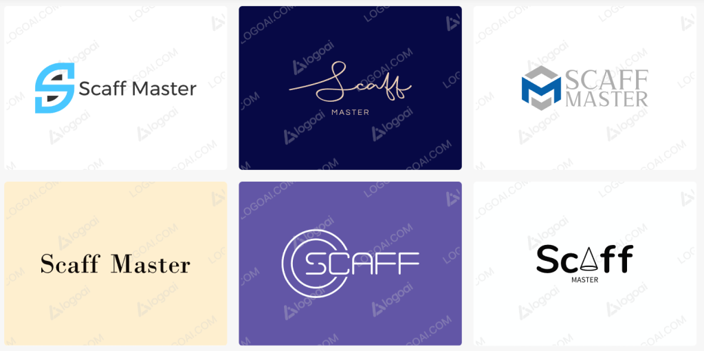
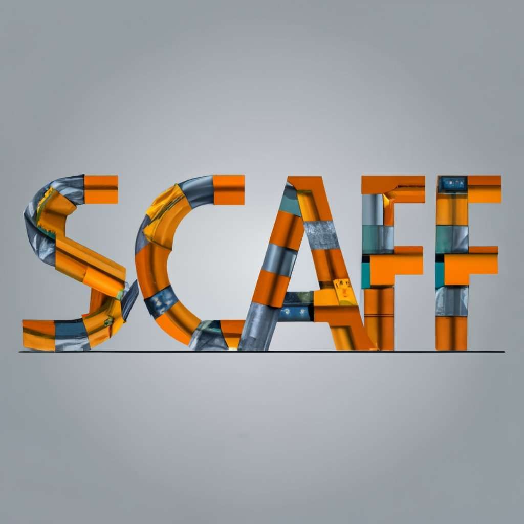
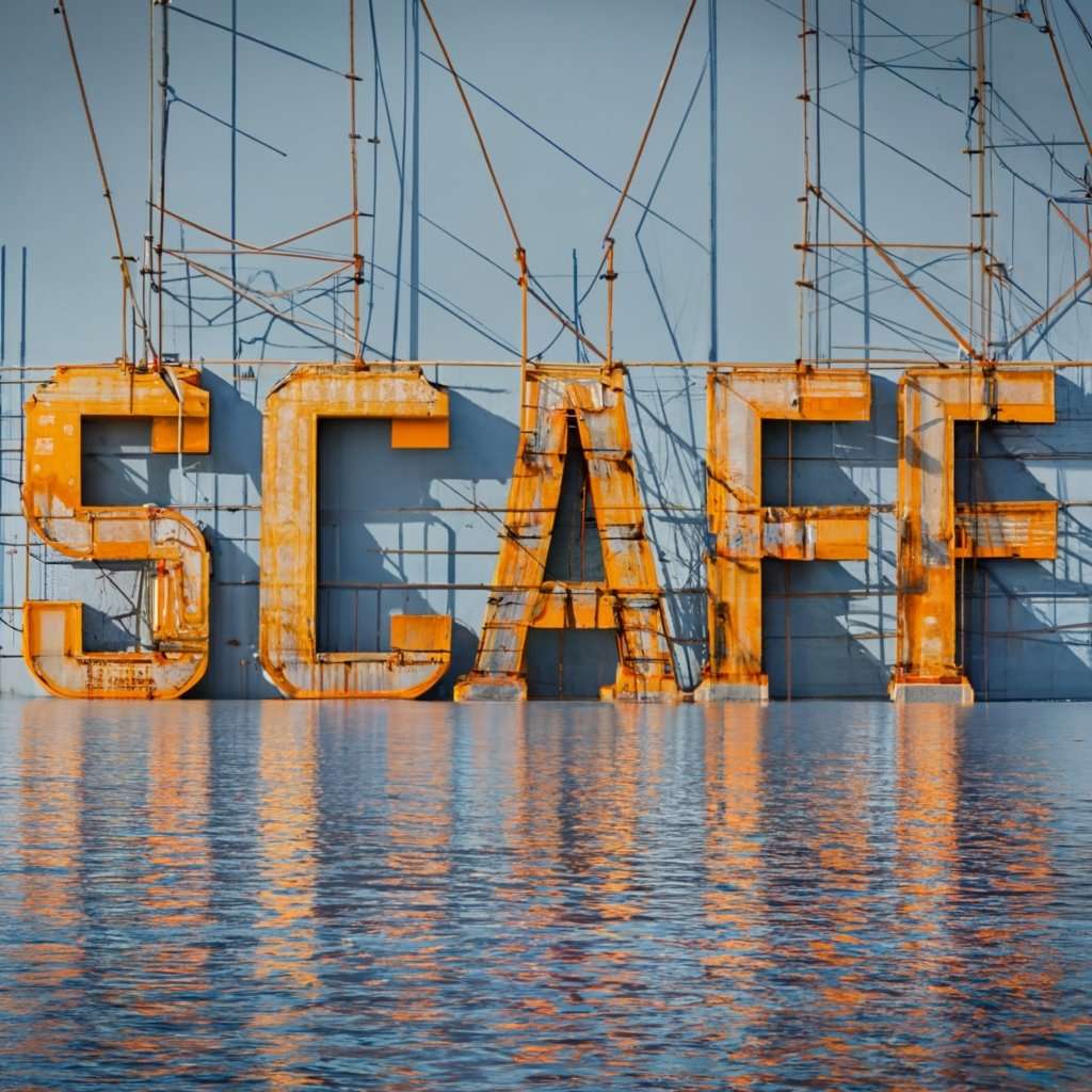
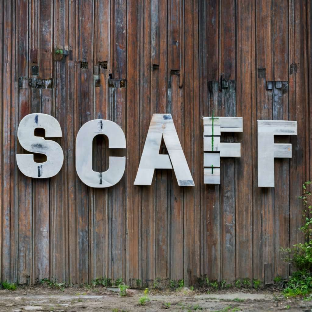
I have an app for scaffolders that I'm changing the name of [to Scaff Master] as it's got much more functionality than it used to. So I need a new logo that relates in some way to scaffolding and maybe a mobile phone (? I have no idea about this stuff - which is why I'm asking!)
The only possible complication is that the app logo could be displayed in the top corner of the phone so something that would look good in a fairly small size (190 x 190 pixels) would be advantageous. I guess simple is better.
Two questions:
1) Anybody fancy a go (assuming I can afford it!) ?
2) How much?
Use ChatGPT.
Free.

Starter for 10.
Use ChatGPT
Didn't think it does artwork?
I've had good luck with https://99designs.co.uk/ if you know roughly what you're after, and are looking for some input (and ultimately someone talented to create it)
You have to be quite specific with your brief though because - while very talented - a lot of the creatives who work on it aren't english natively and you don't get that 'discovery phase dialogue' that you'd get if you went through a proper agency (and paid £1k - £+++++k).
If you know exactly what you need and just need it realised, fiverr.com. But I'd avoid that as it sounds like you don't.

Create a Canva account, have a free trial and play around. That's all the agencies I seem to work with do at the moment!
The word Scaff in Scotland has negative connotations. It was used a lot in the 80s as an insult.
'You are a scaff' or 'they trainers are pure scaffy'.
Just use this one, I doubt anyone will notice.

Just use this one, I doubt anyone will notice.
!!!
Actually logoai.com has given me some ideas.
Actually logoai.com has given me some ideas.
Yep - the first one in the image - if the corners were rounded then it would look like scaffold poles.

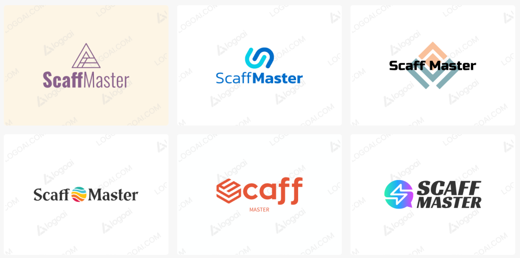
Or something like this (but neater - this took about 15 seconds to scamp)...

Give me a shout if you want something properly drawing up and exported to a .eps file
That top left one from logoai is great. The S anyway
now take that to a designer and get them to make the S into SM and you’ve got a decent logo!
or change your input to just SM. Get it to output that part of the design. Then just add the text
Just take one of the logo AI ones and be done with it. Most cheap folk on 99 Designs and Fiverr just pretend to make it and do this. Have spent up to £1k in past using both services, followed by £10k from a decent agency on bits for work. Not happy with any of it.
Alternately just use your business name in a font of your choice, then leave it alone or stick it in a square or circle like most well known brands.
Arggghhhhh!!
Thoughts on this? (if I get 20 likes I get it for free!)
I quite like the way the A and the F could look like poles and I could just us the A as the app logo on its own.
https://www.logoai.com/logo/2077452
That reads to me like 'Scoff' - not quite sure why though. And triangles aren't really suggestive of scaffold, being the wrong basic shape.
And 'Scaff' also sounds too much like 'Spaff' for my liking LOL!
Make the triangles circles and they look more like scaffold...

not quite sure why though
Because your (and everyone's) brain craves the familiar, and it doesn't think 'scaff' is a real word whereas 'scoff' deffo is.
Looks like Bristol & Avon logo.
Orange tippers.
https://www.bristolandavontransport.co.uk/?utm_source=google&utm_medium=gmb&utm_campaign=bandagroup
I needed a small logo for an App, in the end I just used one of FontAwesome's icons!
Looks as good as anyone else's...
[url= https://live.staticflickr.com/65535/53255398898_7ec87f0790_m.jp g" target="_blank">https://live.staticflickr.com/65535/53255398898_7ec87f0790_m.jp g"/> [/img][/url][url= https://flic.kr/p/2p8ZQGJ ]App Icon[/url] by [url= https://www.flickr.com/photos/brf/ ]Ben Freeman[/url], on Flickr
Thoughts on this?
One thing to bear in mind is that when it's scaled down to 'icon in a mobile app' size, the 'master' lettering will be pretty much invisible
Yes, but I can leave that out for the app icon and just use the tubes
Make the triangles circles and they look more like scaffold…
Good idea.
OP - how much money is it making at the moment?
Either it’s making enough that you can pay for proper design input, or you’re still at MVP stage, in which case you just need something not awful as a holding logo.
Improving your install conversions comes after proving your MVP in terms of the order of tasks and expenses.
Good idea.
See above - I quickly scamped it up for you....
This...
The word Scaff in Scotland has negative connotations. It was used a lot in the 80s as an insult.
‘You are a scaff’ or ‘they trainers are pure scaffy’.
^ Came here to say this. Not just the 80's - it's still very much a thing nowadays. I think it's to do with the bin lorry (aka scaffy wagon) but I'm an English immigrant up here so not 100% sure.
I'd definitely have a re-think on the name, it's not quite like selling a Hyundai Kona in Portugal, but still...
Scaff is used a lot in the scaffolding world....... Pro-Scaff, Scafftech, etc.
Either it’s making enough that you can pay for proper design input, or you’re still at MVP stage, in which case you just need something not awful as a holding logo.
Still at MVP to be honest and a holding logo is probably fine. It's a pretty niche app and the target market aren't going to really care about the exact name or the logo - they get a customised version that includes their own logo anyway.
The existing name [Scaffold Inspector] just doesn't seem right now as the app does a lot more than it's original incarnation.
Oh and thanks for all the input ..... it wasn't expected and every day's a school day!
If you’re still at MVP stage, the name isn’t important either. Speak to your customers and find out where they’re getting value from it and how they’re using it.
That’ll help with naming and then with the logo?
One thing to bear in mind is that when it’s scaled down to ‘icon in a mobile app’ size, the ‘master’ lettering will be pretty much invisible
See the current cluster**** that is the ‘redesign’ (and I use that in the loosest possible sense) of the X, formerly Twitter ‘home’ icon. It looks like Musk got an intern to ‘design’ it five minutes before they got kicked out the door. Any of those logos from logo.ai are vastly superior, and I say that as someone who worked in print, design and publishing for over thirty years!