![]() You don't need to be an 'investor' to invest in Singletrack: 6 days left: 95% of target - Find out more
You don't need to be an 'investor' to invest in Singletrack: 6 days left: 95% of target - Find out more
I've been meaning to do this forever but keep forgetting... Basically, I want to get probably a couple of hundred stickers made up for the glentress trailfairies- we're kind of on hiatus just now but that's no reason not to put stickers on bikes, helmets, bike stands and uplift trailers I reckon. Probably some in 100mm-ish and some in whatever the smallest useful size the design will print in
But, I cannot do graphic design at all (maybe if I could get my copy of Micrografx Designer 3.1 to run, but I think that needs a Windows 3.11 machine for that). Can anyone recommend a well priced design-plus-print service, or perhaps IS anyone on here a well priced design or design-plus-print service? I don't mind paying a fair price, whatever that might be.
I can however work MS Paint, so I have made a beautiful design doc:
Any help much appreciated!
I like the logo, it’s nice and clear and simple, the spade handle could be shortened a bit, perhaps, but I’d ditch the font; it’s a nice idea, but at a small-ish size all the little gaps will fill in and it’ll just look scruffy. It needs a fairly simple sans-serif font of a moderate weight, if it’s too bold it’ll start to look like one solid line. Sadly, I no longer have access to a Letraset catalogue, that was the standard reference work to start with.
Thanks for the input! The font goes back over a decade and is on everything else we've ever printed so we're a little bit stuck with it... Though the brushstrokey infill isn't that important, the silhouette is pretty strong even when the detail isn't visible
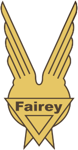
The logo is ChrisL of this parish's work, it'sthe exact crappy blue #2 tapermouth shovels the FC give us, which I reckon's a really nice touch, and the circle-and-wings off the fairey aviation company because he's a plane nerd (I'd have stolen the wings off the GT logo personally but it's nice and geometric)
I've trail fairied* once, that spade should be replaced by a cake.
*And now I have actually got my degree I have time to do it again more reglar like. When will it not be on hiatus
Ross @ McKend down this parish could help you with that:
Or the guys at A1:
All thoroughly good chaps
They'll probably be able to print them in-house too, but if not a small run that that could go through TradePrint:
https://www.tradeprint.co.uk/stickers-and-labels/stickers?Size=37mmx37mmCircle&Quantity=70&Service=Express
Their QC's not the best (it's non-existent), we stopped using them after half the print job we received had the previous client's name ghosted all over it. Again. But they can't bodge a sticker job too badly.
If you have the design, or have a nearly finished design, I can print them for you. STW rates apply.
Edit. Several designers on here, get help on the design.
Something like this?
[url= https://i.ibb.co/BTLph19/Untitled-1-02.pn g" target="_blank">https://i.ibb.co/BTLph19/Untitled-1-02.pn g"/> [/img][/url]
Maybe abbreviate the text - "GTF" ? 😁
OP. Pm me and I’ll give you my work email address.
I think the branding (as much as we have) has moved from "Glentress Trailfairies" to just "Trailfairies" in recent years.
joshvegas
Free Member
And now I have actually got my degree I have time to do it again more reglar like. When will it not be on hiatus
Nobody's sure, sadly. The Tweed Valley MTB rangers seem to have hoped to get Trailfairies sessions going again at a few points over the past year but the plans never seem to have come together. At this point we're probably hoping that their workload drops enough that they get a chance to organise something.
Just my opinion, but I really don't think the fairy wings look like fairy wings - they look more like a medal.
The wings were inspired by the logo for Fairey Aviation, because, as Northwind said, I'm a bit of an aviation nerd.
I would say the same. Looks a bit “Military”
I’m sure a suitably creative, artistic and skilled designer could come up with something much more suitable and eye catching.
Vector format, whatever file format.
No problem knocking out a few 100 for a good cause.
Just for balance, I think it looks great. The Fairey useage is inspired.
The wings were inspired by the logo for Fairey Aviation
Fair enough, your logo, your choice. I was just expressing my opinion (and I don't think the Fairey logo looks like fairy wings anyway).
Ahh, I see the direction it’s coming from now…
More fairyish fairy wings...
[img]  [/img]
Thanks for all the feedback folks, some great leads there and it also helps my addled brain to work.
Just to clarify, we essentially have the logo and the design and we're using both much as they are, it's the implementation part I'm stuck at- we don't have anything that I can send to a cheap online printer and say "make 100 of this", the important part is taking my shithouse bmp and turning it into something usable using actual skills. I'd like to come away from it with a useful vector file that I can use in future rather than being tied to one printer.
The logo itself, imo the Fairey wings are totally in the "clever for its own sake but doesn't really work that well", as is the blue tapermouth shovel, they both need explained and that's a design fail but it's fine here I think. It's not a good logo inasmuch as it's not going to be independently recognisable, but then we're not Starbucks, and it'll probably never appear without the text accompanying it, it's basically just adding some visual interest to the words.
I should have added to the original post the actual reason for making these! It's really just a bit of fun, something for the group as much anything else and if I'm honest something to help keep us tied together til we get out and dig again. It's not a promotional item, especially because right now we have nothing to promote! And part of the reason for using it is that ChrisL is a key loadbearing part of the group, so I'm throwing him a biscuit. I'll probably do some words-only ones as well at some point.
(Joshvegas is right, the other direction is definitely cakes- the motto that belongs with the name is "Build trails, eat cakes, ride trails, eat cakes" but that's a bit trickier to implement. Also I am gluten intolerant. I did a crossed mattock and shovel over a fairy cake that was a bit pirate/sea shepherd, it made me laugh but it was way too busy. And my hammer-and-sickle inspired design didn't go down terribly well with the boss. Like i mentioned I did one with the shovel but with GT's angel wings off their logo, and it looked better imo but it also was definitely angel not fairy wings, so it mostly looked like someone'd murdered a shovel)
ChrisL
Full MemberI think the branding (as much as we have) has moved from “Glentress Trailfairies” to just “Trailfairies” in recent years.
Yes but given that it's a stupid-ass decision I've elected to ignore it.