![]() You don't need to be an 'investor' to invest in Singletrack: 6 days left: 95% of target - Find out more
You don't need to be an 'investor' to invest in Singletrack: 6 days left: 95% of target - Find out more
thx, the skill of the artist or the crudity of execution is irrelevant.
The effect on the viewer is all that matters.
Can Dylan hold a note? Not really.
Are his performances more expressive than Whitney Houston's?
They are to me.
And that's sll that counts.
[img]  [/img]
This is a favourite of mine, Dave White. Really wanted to buy a limited edition print but couldn't at the time.
wondered when the infamous bricks was going to make an appearance.
🙂 exactly! I was lucky enough to view it at the Tate.
[img] 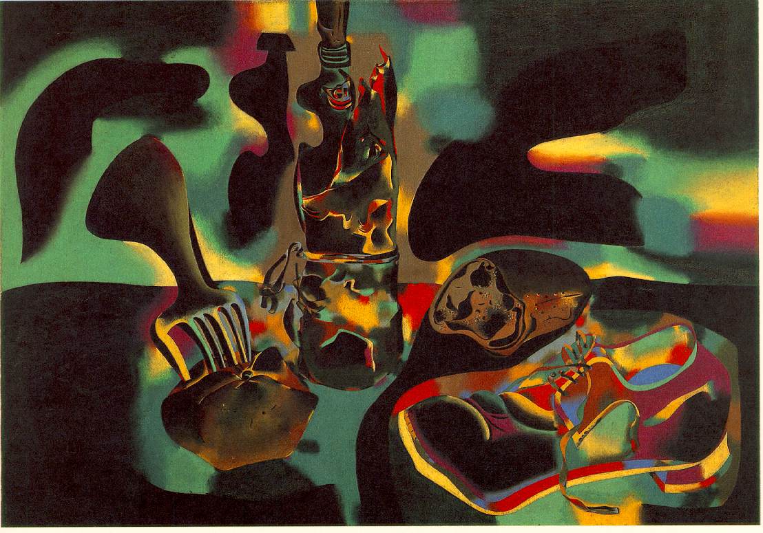 [/img]
Still Life with Shoe
Another lover of Miro, this is my favourite although you don't get the luminosity of the colour on the screen, likewise you don't get a true feeling for Dali's crucifixion from the image posted earlier.
I assume you're joking, or being 'ironic' or something, otherwise that 3 years you spent at art college was a waste of taxpayers' money. Why not actually attempt some constructive criticism, rather than being childish?
How dare you!!! I expend a great deal of thought on my criticism
[img]  [/img]
My favourite painting:
[img]  [/img]
I love the juxtaposition of the military uniform on the man’s top half, and in the background, with the hunting boots and breeches on his bottom half. The man is clearly deep in thought; it is the boots and breeches that tell us he is dreaming of being at home in the hunting field.
I also really enjoy M C Escher's work.
[img] 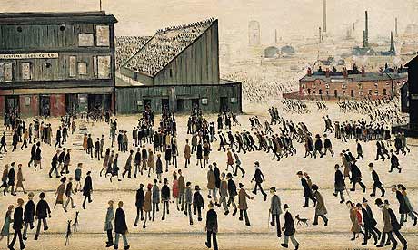 [/img]
Rusty Spanner - I love that Bonnie Burnley by Sue Rose.
However I've just googled her and it's coming up with some American artist and her work doesn't look the same as yours.
Have you any more info please?
Another Doig:
[img]  [/img]
Which, when I saw it, I linked to:
Bunnyhop, ygm at your work email address.
[img]  [/img]
Andrew Wyeth, [i]Christina's World[/i], 1948.
Mrs R worked at Tate Modern for many years so I've seen an awful lot of stuff - particularly like the Rothko's
I think the one that stands out for me is Yves Klein's IKB 79 at Tate Modern.
[img]  [/img]
You have to understand the process and actually see it to 'get it'.
It's not just a blue canvas
On Stuckism:
During WW2, Picasso lived in Marseille. It is told that he met an SS officer one day in a bar who knew who he was and took to berating him for producing "degenerate" art. The only true art, said the Nazi, was art that portrayed reality is it actually was...
Picasso let the guy run out of steam and then asked if he was married, to which the Nazi replied in the affirmative, and pulled a small photograph out of his wallet, proudly showing it to the Great Man.
"She's very pretty" said Picasso, "but... so tiny!!"
this is one of the most interesting threads as far as I'm concerned. What really interests me is why and what attracts someone to a certain picture or painting. It's great putting up links to cool stuff, I just wonder what makes certain paintings/art so involving and important. especially the older conservative portrait painting stuff. Why is that so great?
I must have reread this thread a dozen times and there are some pictures and artists that I'd never heard of that have blown me away.
Thanks everyone, it's great seeing what other people are into. 🙂
Somafunk; fair enough, [b]but as long as you're aware that all you are looking at are some crudely daubed large canvasses, not something crafted with exceptional skill or talent[/b]. And be aware that setting and context play a very important part in how your subconcious receives the work; take a Rothko painting, and stick it on the wall of a dull restaurant or office foyer, and you'd probably pay it no more than a fleeting glance; a splash of colour to brighten up the place. But put it in a prestigious art gallery, and suddenly people start raving on about it. Just makes me laugh really. But then I suppose peole will be along to attempt to justify it, and claim I'm 'visually illiterate' or some other such nonsense. By all means enjoy it, but you could get the same enjoyment out of looking at a damp patch on a wall, if you put your mind to it. that's the truth.
Total bollocks. I'm with somafunk, I went to the Tate Rothko exhibition, because I was interested in seeing more of his work. Personally, I prefer his earlier, brighter works, but I can appreciate the later, darker ones. The reason I highlighted that sentence, is because one of the features of the exhibition were as series of photos taken of details of the restaurant group under different UV wavelengths. A mate of mine used to rave about Rothko, and would happily sit or hours staring at them, given a chance. I was ambivalent, but gave him the benefit of the doubt.
Anyway, these detail photos reveal that there are many layers to a Rothko, and those layers, which are applied in specific ways, fluoresce in different colours under UV. This is deliberate, not accident, and it seems Rothko was aware of the colour differences while painting, and it's the reason my mate loves them so much, because he's sensitive to the UV end of the visual spectrum, and can see details that are invisible to me.
You are clearly unaware of the underlying subtleties of Rothko's paintings, and by continuing to dismiss them you are just making yourself look like a pleb.
I'm still trying to decide on a favourite painting; Hopper's [i]Nighthawks At The Diner[/i], partly because of the Tom Waits connection, comes near the top of the list at the moment.
There's been a few mentioned that I really like, Bridget Riley, Mark Demsteader, John Singer Sargeant, Hokusai and Hiroshige, for example. I very recently came across the Meredith Frampton painting, and I was mesmerised by it, it's stunning. There's one artist who's works I always look forward to seeing at the RA Summer Exhibition, and that's Alan Jones RA. His portrait of Darcy Bussell is one I always go to see when I visit the National Portrait Gallery.
I love his deftness of line drawing, and his vibrant use of colour.
[IMG] 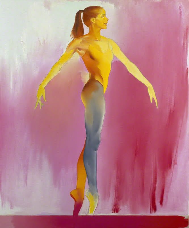 [/IMG]
[IMG] 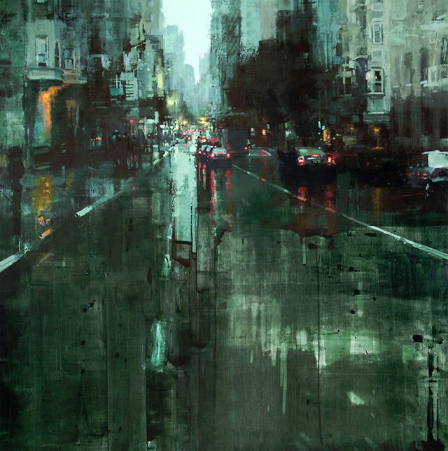 [/IMG]
[IMG] 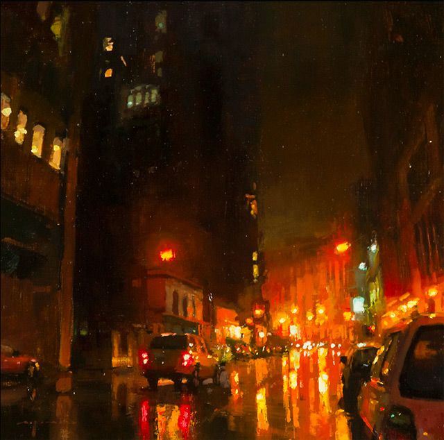 [/IMG]
Sputnik those images remind me of the designs for BladeRunner by Syd Mead. Incerdible artist imo. who painted them? esp the green one?
Love this thread keep it spinning...
Goya, El tres de mayo de 1808 en Madrid
[img]  [/img]
The portrait in my attic which I can't show you.
or
Nighthawks; you could walk into a room where that was hanging every day for the rest of your life and come up with a new story every time, or just endlessly embellish on one story. It just looks like it's about to come to life, if it were hanging in my house I'd keep bursting into the room in the hope of catching it out. I imagine a whole series of films in which that one scene takes place but it's the only thing that links them.
[img]  [/img]
Sappho at the Leucadian rock by Charles Mengin
kevevs - I inspected the code to see they are Jeremy Mann. I like them too.
Kevevs, Alex is spot on. Jeremy Mann, San Francisco based artist. This one is pretty good too :
[IMG] 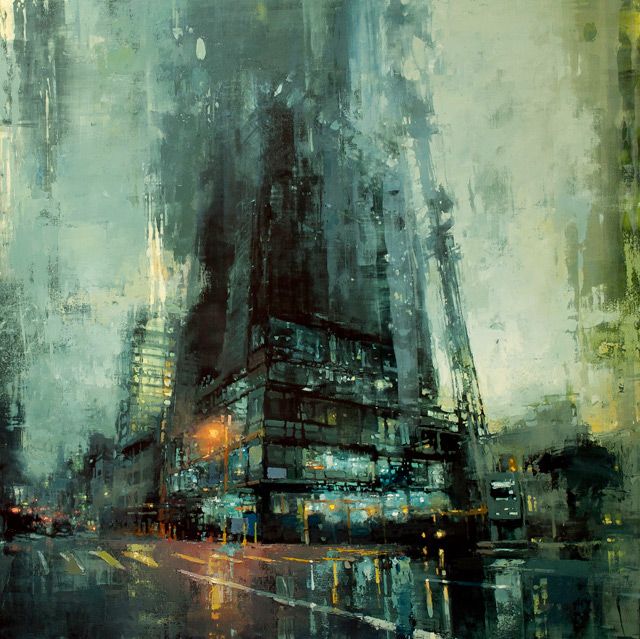 [/IMG]
http://www.bbc.co.uk/arts/yourpaintings/artists/kyffin-williams/paintings/slideshow#/53
Kyffin Williams
always been partial to a bit of Turner....
[img]  [/img]
Those Jeremy Mann ones are great!
[img]  [/img]
Agnes Cecile
[img] 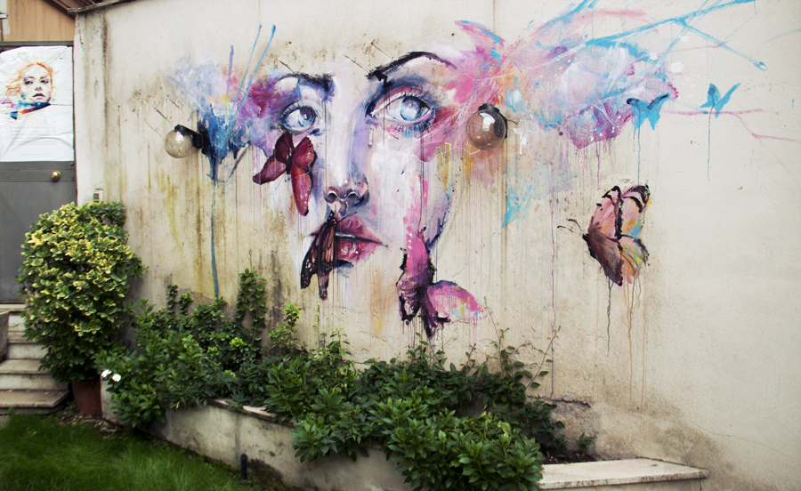 [/img]
Sputnik, those Jeremy Mann paintings i reeeaaaalllly like, very Bladerunner as Kevevs said. 8)
Very dark if you get me drift.
^ If i was to pick street art, i like the stuff this french guy - C215 - [url= http://www.flickr.com/search/?q=C215 ]Christian Guémy[/url] is turning out.....
[img]  [/img]
Liking those Jeremy Mann paintings a lot! Great use of reflections on wet surfaces.
Long been a fan of quality street art, and this one in Bristol is a beaut, I really love the way the various characters blend together:
[IMG] 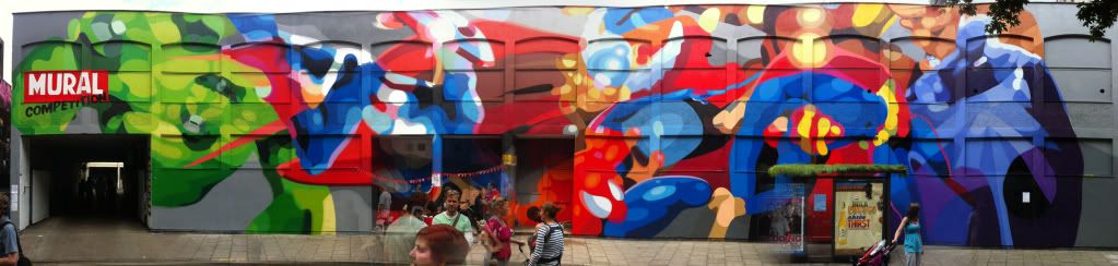 [/IMG]
I really like stuff from Drew Darcy, but not solely for the subject matter, though it may be a little racy for on here 🙄
Big fan of Glenn Brown myself, in all his styles. Tate show in Liverpool was great.
[img]  [/img]
[img]  [/img]
Just saw this the other day and thought it was an amazing painting.
[img]  [/img]
Arnold Boecklin - Island of the Dead
There is something about it I fine totally mesmerizing about it.
A New York artist I'm appreciating at the moment is Alex Kanevski
http://www.somepaintings.net/Alex.html
Difficult to pick individual ones, but I've tried below:
[img]  [/img]
.
[img]  [/img]
.
[img]  [/img]
[img]  [/img] I could go on about this, but it's just wonderful.
Really interesting thread with lots of brilliant images. My favourite artist is Peter Howson, I've always loved the way he paints people.
[img]  [/img]
yess! Peter Howson. Good call!
A bit of Kandinsky
[img]  [/img]
Shaun Tan is an amazing illustrator
[img]  [/img]
Cheers folks, theres some new artists i've added to my "like" list after browsing through this thread, they've been noted down in my "little book of stuff to do/explore" and over time i'll do more research and see what else they've painted.
In the order that they appear in the thread i've highlighted the following :
Mike Bell
Yves Klein
Jeremy Mann
I recently bought my first ever "original painting" of Graeme Obree by Joe Scherrer, i've owned the print for a while but i met the artist by chance recently and enthused wildly about the print regarding Graeme and the hour record and the way he smashed it - he is one person i have always respected for his achievements/convictions/belief and honesty in cycling. Joe offered to sell me the original so i thought about it for a few days as it was a helluva amount of money for a painting, possibly one of the most expensive things i've ever bought after my bikes/car but i decided i had to have it so i sold a bike and used what cash i could gather together, i vividly remember exactly when Graeme broke the hour record and i've followed him ever since, his honesty and the way he turned his back on a pro career and a paycheck of hundreds of thousands as he refused to dope is humbling. For sure he has his faults but don't we all?. It still needs to be framed but Joe is going to do that for me, so if my house burned down now i'd grab my bikes, laptop, and my painting 😀 , Joe was commissioned to do a series of cycling greats, Coppi, Merckx, Yates and Obree, of which the Obree painting was also used at the "Flying Scotsman" premiere.
Coppi, Merckx and Yates were used in a book about the Tour De France called [url= http://www.amazon.co.uk/Golden-Stages-Tour-De-France/dp/1874739285 ]Golden Stages Of The Tour De France[/url], Joe himself raced in Europe in the late 70's80's before retiring and becoming an artist, some of the tales of the time are worthy of a book.
[url= http://www.sportandpublicity.co.uk/Prints.html ]Joe Scherrer Prints[/url]
Not a good picture of it at all as it doesn't do the detail justice but the best i could do wi my crap camera - it looks stunning in the flesh so to speak, my first bit of "art" and i'm well chuffed, now to find an original Rothko 😀
[img]  [/img]
I very recently came across the Meredith Frampton painting, and I was mesmerised by it, it's stunning.
Agreed. i saw it for the first time about a year ago and couldn't walk away! Absolutely stunning in real-life.
Before I saw that Frampton painting, I saw this one:
[IMG] 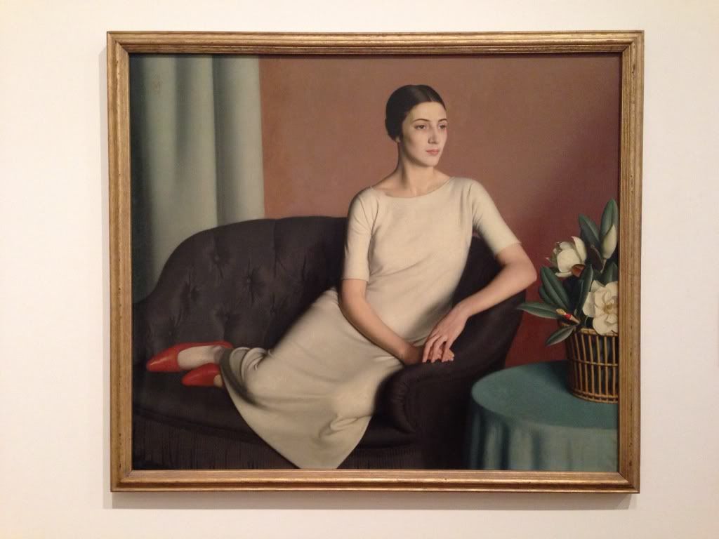 [/IMG]
[IMG] 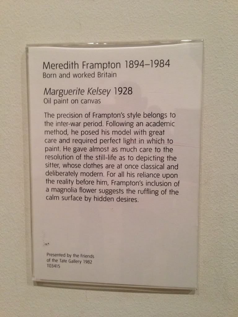 [/IMG]
Beautiful painting, so contemporary, and uncluttered. I could sit and look at it for hours.
I went to the Tate today.
Sadly, this wasn't there. (They are doing work on the gallery overall, so all good.)
[img]  [/img]
The British Channel Seen from the Dorsetshire Cliffs, by John Brett/
CFH, that's gorgeous! Could be parts of Devon, also... 😀
This, for some peculiar reason, I found oddly pleasing:
[IMG] 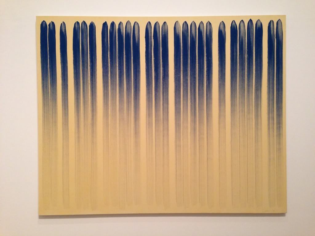 [/IMG]
[IMG] 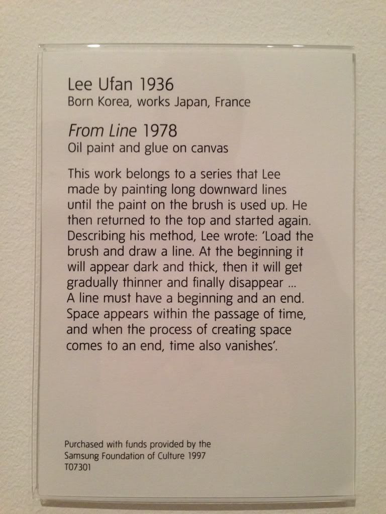 [/IMG]
Oh, and as we were talking about Rothko, I tend to prefer this period:
[IMG] 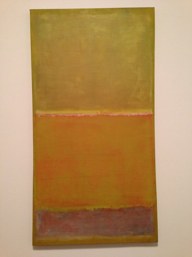 [/IMG]
It's not just a blue canvas
To me it's just a blue canvas (but I know art is subjective and what not and there's probably a greater point that I can't see).
I love this, not technically a painting though.
[img]  [/img]
Could be parts of Devon, also.
Oddly, that's EXACTLY why I like it. I grew up on the South Devon coast, and it reminds me of the light, the sky, the sea from that period of my life. I know it's painted as Dorset, but in my heart I feel it's Devon.
cool stuff Somafunk! Labsey is that the same illustrator/designer that did the Lemon Jelly stuff? looks familliar.
I have a favourite painting from a non art point view. My Mum sold this, she was a hobbling old bird with a wonky hip.
[img]  [/img]
Paid for my Mum's hip Op with change. 🙂
it's all about the money Richpips!
it's all about the money Richpips!
Yes, I guess so, or wait as she wasn't NHS urgent.
She does have ~30 goats ~10 geese and numerous chickens.
3 bales of hay and one of straw to cart a day.
72 years of age.
[img]  [/img]
Kevevs : Lemon Jelly's artwork was designed by "Airside", Fred Deakin (DJ/producer side of Lemon Jelly) owns the company and has done creative work for just about every blue chip and ftse 100 company there is - an incredibly talented individual and i love his design work.
[url= http://airside.co.uk/ ]airside[/url]
sorry Richpips no offence, but that's a boring and crap painting imo.and it's all about opinion with this stuff. I'm glad you got a few quid for it. I just knew it was him Somafunk! shit hot!
kevevs - is there any point in expressing that opinion in this thread though? There are loads on here that I don't like, but that doesn't make them crap.
I believe it's a Brian Sheilds (known as Braaq) who does seem to have a following (industrial working class northern scenes):
[url= https://www.google.co.uk/search?num=10&hl=en&safe=active&site=imghp&tbm=isch&source=hp&biw=1078&bih=1054&q=braaq&oq=braaq&gs_l=img.3..0j0i24l8.1161.2232.0.2486.5.5.0.0.0.0.92.345.5.5.0...0.0...1ac.1.5-62_iaquks ]Google Images Search[/url]
Not my cup of tea, but I certainly wouldn't dismiss it as crap.
I am massively into Modern British art (1950-1970s), mainly abstract works. Got a fairly large collection, but my favs have to be works by William Gear and Roy Turner Durrant. Will post pics if anyone is interested in seeing.
Please, would be good.
somafunk - I love Airside stuff. I bought one of 50 of these big silk screen prints when they released the first EP, numbered and signed by both of them.
[img]  [/img]
Looks great! 😀
Always been fond of:
[img]  [/img]
Few here, first up a William Gear acrylic and ink from 1959
[IMG]  [/IMG]
The next two are both by Roy Turner Durrant, done in the '60s.
[IMG]  [/IMG]
[IMG]  [/IMG]
I mentioned Gerald Scarfe earlier; I see this cartoon is provoking a lot of reaction today:
[img] 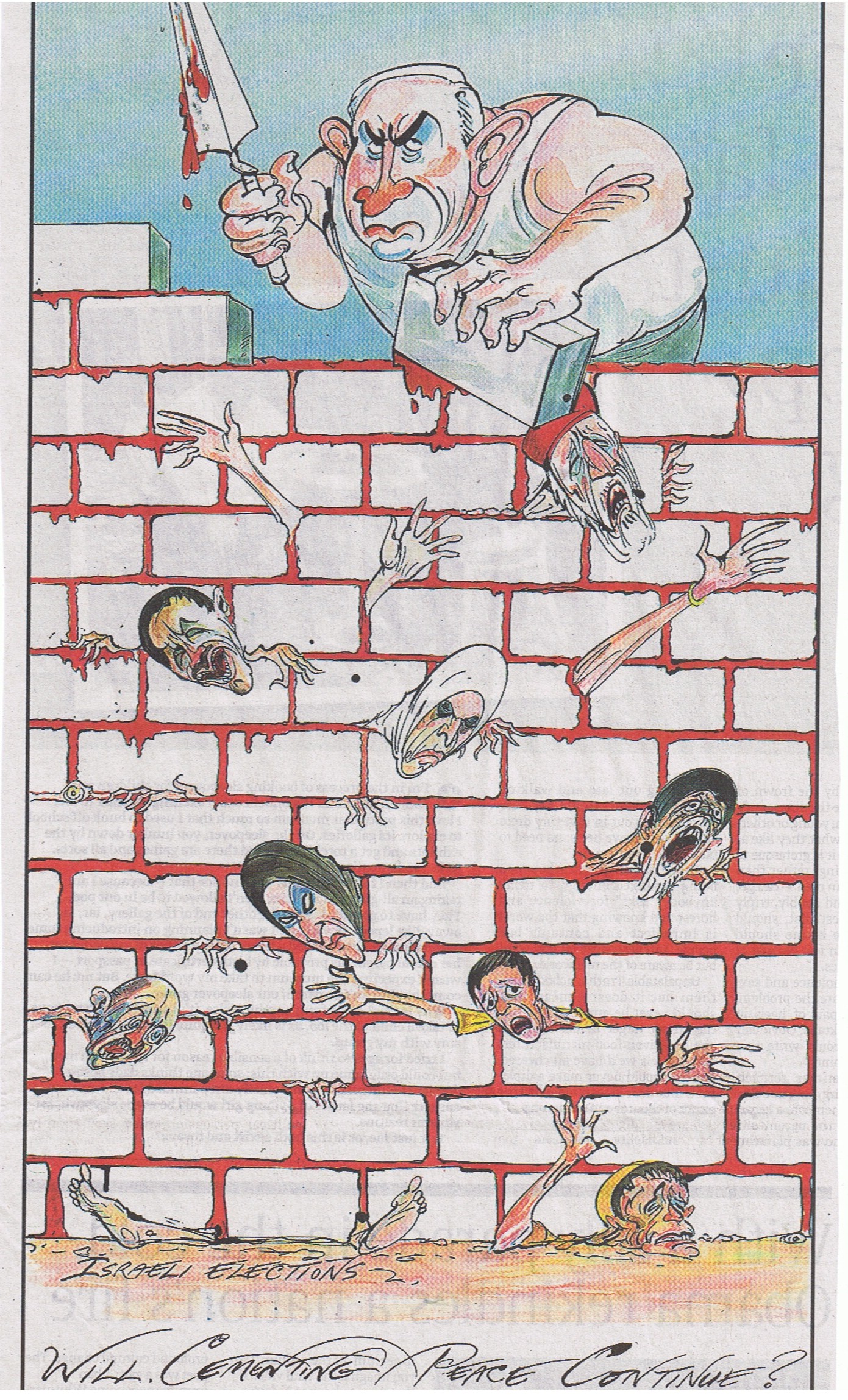 [/img]
You are clearly unaware of the underlying subtleties of Rothko's paintings, and by continuing to dismiss them you are just making yourself look like a pleb.
What an arrogant statement. It's this kind of snobbishness and elitism that hinders universal enjoyment of art; 'if you don't understand it you are inferior and unworthy'. To quote you: 'Total bollocks'. Read some of the comments regarding Jack Vettriano, this one in particular:
perfect fodder for the greetings card market since the demise of Athena poster shops.
ephemeral dross for the visually illiterate.
Yet make a similar comment about Rothko, and you're a 'pleb'. Interesting. Art is completely subjective, there is no right or wrong. I have no problem with anybody interpreting a piece of art in any way they chose, just don't get all pretentious about it if you want to be taken seriously. That Rothko and others have to attempt to 'explain' his work shows how it fails to communicate effectively as art, in my opinion. Art should speak for itself, without the need for further explanation.
The reason I highlighted that sentence, is because one of the features of the exhibition were as series of photos taken of details of the restaurant group under different UV wavelengths. A mate of mine used to rave about Rothko, and would happily sit or hours staring at them, given a chance. I was ambivalent, but gave him the benefit of the doubt.
Anyway, these detail photos reveal that there are many layers to a Rothko, and those layers, which are applied in specific ways, fluoresce in different colours under UV. This is deliberate, not accident, and it seems Rothko was aware of the colour differences while painting, and it's the reason my mate loves them so much, because he's sensitive to the UV end of the visual spectrum, and can see details that are invisible to me.
I'll refrain from being rude about this particular statement, suffice to say that it made me laugh. Instead, I'll leave it there, with this comment:
But anybody who likes Rothko has a nerve slagging Vettriano, both are poster art, bought by people becuase they are inoffensive and match the furniture.
[img]  [/img]
Rusty Spanner - Member
Hora, it's the Lady Lever Art Gallery.
Link.
I went on Sat and..
IT WAS IN STORAGE...
noooooooooooooooooooooooooooooooooooooooooooooooooooooooooooooooooooooooooooooo
Peter Howson currently showing at the Maclaurin in Ayr. Awesome, well worth a visit
Here's mine:
Paul Feiler, Inclined Oval Brown
[img]  [/img]
Walter Sickert, Bathers Dieppe
[img]  [/img]