![]() You don't need to be an 'investor' to invest in Singletrack: 6 days left: 95% of target - Find out more
You don't need to be an 'investor' to invest in Singletrack: 6 days left: 95% of target - Find out more
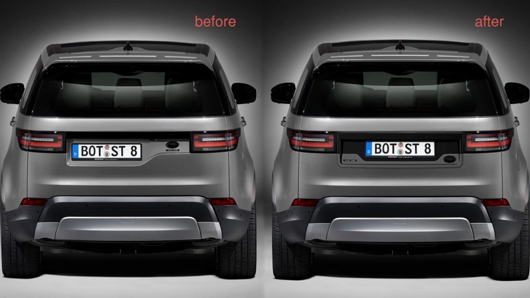
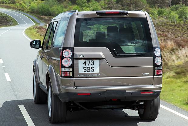
Driving in to work I saw this (or similar) on the motorway - I know they're trying to evoke the previous discovery with the square number plate, but jeebus who thought this was a good design choice?

You should see the convertible! Looks like all it's missing is a fascist dictator on the back seat.
Also who buys a 4x4 in white
Also who buys a 4×4 in white
The Pope?

This one in particular irks me. mainly because there are strict instructions from LR to the dealers on how to fit the plates so it doesn't look (as) shit. There are 3 things wrong with this:
1. The dealers will not, and clearly do not, read those instructions.
2. The need for the instructions for fitting the plate in the first place means that something is very wrong
3. The new owner, having shelled out #50-odd grand on a new car now has one that annoys everyone behind and also themselves every time they go to the supermarket.
jobless - have you got a pick of a less shit one or is the top pic as good as it gets?
Vertical shocks on MTBs, ideally shocks should be mounted horizontally to the downtube, top tube is reluctantly acceptable.
The indicator lights on some vehicles that are too close or are built in to the brake/rear light clusters.
Can't remember what brands ,I may have been too dazzled to notice .
Ugh. That Disco makes my teeth itch.
That Discovery really does annoy me every time I see one, but not so much as the overall design from about the b-pillar backwards:

It's just so bulky and badly-resolved, and the car itself is absolutely massive. It looks a bit like the upper half of a cabin cruiser sunk in a shallow lake.
In a similar vein the old land rover freelander had the brake lights right at the bottom of the bumper so they were really low and difficult to notice. Bloody stupid.
Anything that is meant to be disassembled by the end user but which is then difficult to do without a) breaking off hidden retaining tabs b) drawing blood c) specialist tools. ie. replacing bulbs on many modern car headlights.
This seems to be the way the dealers are meant to affix the number plate

Still nope.
Is that to remove the eu flag? Don't think that helps much
1. The dealers will not, and clearly do not, read those instructions.
2. The need for the instructions for fitting the plate in the first place means that something is very wrong
So is that number plate up there fitted wrong?
It is horrific looking it's like a BMW X6 or Audi Q3 that goes someway to proving money can't buy you taste.
Blue passports.
This seems to be the way the dealers are meant to affix the number plate
I see what you've done there. Nice.
Nissan Juke
/end of thread 😉
Land Rover has a proud recent history of this sort of bollocks. The Evoque looked like a proper Range Rover which had had a skip dropped on it.
But that number plate definitely makes my OCD itch. Strangely, haven't seen many of them about, so I wonder if it makes Land Rover customers feel odd as well.
There are quite a few round here. They don't look too bad in the flesh except from the back. Black seems to be the best colour.
Toasters that don't take "standard" size sliced bread. I know in Germany many sliced bread is smaller but this is not Germany!
Vertical shocks on MTBs, ideally shocks should be mounted horizontally to the downtube, top tube is reluctantly acceptable.
Entirely the wrong way round, you beast!
Every right person knows shocks should be vertical. Thank God I've corrected you, and now you can be let out in pubic with correct thoughts.
Someone, somewhere signed this design off
[img] /img]
/img]
Toasters that don’t take “standard” size sliced bread.
Yes and stupid women that buy them
At least when Ford did this to the Granada they were (possibly) trying to divert people into Jaguars - the bran they had just bought
[img] [/img]
Land Rover has a proud recent history of this sort of bollocks. The Evoque looked like a proper Range Rover which had had a skip dropped on it.
I’m pretty sure that the current design language for Range Rover/Landrover is down to current crash safety legislation, higher ‘shoulders’ to the bodywork coupled with a lower roofline and less glass, to offer greater passenger protection. I prefer the previous version of the Disco, proportion-wise, but I’m growing to like the latest style. Same with the Evoke, and having driven one, I understand why people like them. Ordinary cars are a bit like it, the Citroen DS3 has a rear passenger compartment that means anyone sat in the back can only see as far rearward as their shoulder, through a narrow slit of a window. Cosy, though.
@nickc - nope! He's right. Vertical shocks are the first sign of fugliness.
Indicators that draw a line with leds rather than flash. They annoy me as much as a Nissan juke and that asymmetric number plate put together
higher ‘shoulders’ to the bodywork coupled with a lower roofline and less glass
I think the lower roof line is for fuel efficiency, so they can get their fleet average numbers down.
Nothing to add here but I'm quite relieved that it's not just me that this really irritates.
It looks even worse from the side, too much rear overhang and looks like a shed has been built on the back-just fugly.
Also who buys a 4×4 in white
My my sister in law. Evoque. Nearly white interior too.
Another brother in law constantly winds her up by referring to it as her vajazzle...
I normally am quite partial to a bit of cheeky asymmetry, but that Land Rover irks me greatly too.
Some more asymmetry recently, though inexplicably, I actually quite like this obviously pig ugly car.

I like that red car. Looks like Aardman animation designed it.
Do they swap the rear pillar to the other side for RHD cars??
@nickc – nope! He’s right. Vertical shocks are the first sign of fugliness.
[img]  ?1387017829[/img]
Er, no.
Bob, that is RHD, it's Japanese!
And yet...
phwoarr
The Red Nissan cube in that picture is LHD. It is the other way round on a RHD
In a similar vein the old land rover freelander had the brake lights right at the bottom of the bumper so they were really low and difficult to notice. Bloody stupid.
I never understood that. It's the same on lots of Japanese 4x4s like Shoguns. Despite having a set of lights in the normal place (just below the bottom of the rear window at either side) both the brake lights and indicators are in the bumper. I always assumed it was some sort of regulation height or something.

The Red Nissan cube in that picture is LHD. It is the other way round on a RHD
Obviously didn't read the Wiki right then. Oops...
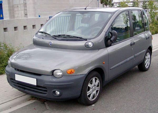
Aaargh hols2 you sadist, couldn't you wait till page 4 before pulling the Multipla card?!?
I’m probably in a minority of one, but I think the Multipla is great.
I really struggle though to see how the Discovery ever got signed off. Did no-one on the design team ever have the cojones to say ‘Stop, this is ludicrous’? Committeee decisions at their best.
I’m probably in a minority of one, but I think the Multipla is great.
What about it do you like? I'm genuinely curious. I cannot for the life of me see how that got signed off and approved for production, but obviously the designers must have deliberated about it and thought it was attractive. I just can't understand their thinking.
I like the fact that it was a practical solution to transporting a family of six. It was shorter than most cars, not as wide as people thought (although the sides were almost vertical to maximise interior space) and didn’t bow down to the accepted norms of car design - until the facelift, when it became a lot more anonymous.
However, I’m a little biased, we had one for about 15 years, transported kids/many bikes around the country - happy times!
I'm with Trek on the Multipla. It was just refreshing that a car manufacture had appeared to start with a clean sheet to provide a very practical vehicle and then were brave enough to give it an unusual look.
I like the fact that it was a practical solution to transporting a family of six.
Sure, it's practical. But the average dog turd is better looking.
Indicators that draw a line with leds rather than flash.
Doesn’t bother me at all, I find it emphasises the fact that the driver has actually taken the trouble to use their indicators and makes it more obvious what their intentions are. But then, some on here find that using LED DRLs as a design feature offends their delicate sensibilities, poor wee lambs...
🤪
What does irk me is the practice of car manufacturers not keeping certain functions consistent, like electric brake operation, some you have to press, some you have to push, then there’s Mercedes habit of not having a separate column stalk for wipers, like every other manufacturer, they stick the function on the end of the indicator stalk as if it was an afterthought. Then there’s Ford, who choose to change their wiper function between ranges, some have the main stalk operate the front wipers when you pull it, on others that operates the rear wiper, you have to press a piddling little button on the end of the stalk for the front screen! Why, for Chrissakes? Keep it bloody consistent! I might be driving twenty or thirty different cars from different manufacturers every day, and it’s always a paint working out where different functions are hidden.
The Multipla is a design classic. Rather than much about with how sharp the folds in the doors were, they designed something unique and functional.
The back end of the new Disco is "heritage" which is a dead end. Jaguar design is so much better now they've stopped trying to make their cars look like late 60s XJs.
Interestingly, jaguar land rover were retooling for a different rear end before almost anyone had seen quite how bloody awful it is. Not sure what the design team got but I assume, it wasn’t a full bonus!
can you imagine buying a wonky disco just before a better looking one hits the dealers? The depreciation will be mind numbing!
I’m so shallow, that asymmetric number plate is all that stops me getting a Disco. Very able car but the rear end is a non-starter for me. I’m not alone and JLR know this and it’s only a mattaer of time before symmetry and aesthetics are restored and, yes, used fugly residuals will plummet. JLR’s “Scorpio” moment. It’s amazing that cumulative depth of engineering talent can be pipped at the post by a moment of madness in design sign off.
Totally agree with the OP - the original was great but they ruined it all ends up.
Back to the Evoque, the designer got it just right. This car is meant to appeal to the nouveau riche market, hence Posh Spice's advertised involvement with the design. Apparently.
It is way over designed and ultra-naff looking, and as a result sells very well to its target market.
Jaguar design is so much better now they’ve stopped trying to make their cars look like late 60s XJs.
Not sure I'd agree.
One of the nice things about the design of Jags is that they all look like Jags. Going back to the forties up to things like the XJ220; remove the badges and you still know it's a Jag. The modern crop of saloons, no matter how accomplished have lost that.
They're like a Mustang without three vertical rear lights, or a Corvette without twin rounds. 🙂
I don’t mind that disco rear end
‘Indicators that draw a line with leds rather than flash.’
I actually like those, but they have totally ruined it because the indicator on the tips of the door mirros light up when the leds start. What should happen is the LEFs light up in line THEN the light on thw wing mirror illuminate like it is the last lights in the line. Now that lack of attention to detail REALLY p’s me off!
and horizontal shock on bikes definately look better.....but only if they are in line with the seat stays. Those bikes where the shock angle is different to the angle of the seat stay’s look awful to my eye.
All Jaguars are usually very nicely designed. Apart from the S Types.
Honda Civic - now there's a mess.
Volvo used to be lovely but getting uglier and uglier.
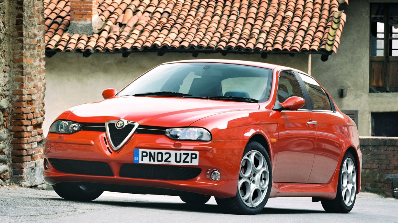
Alfas always interesting and individual.
Oh and when did silver dash trim become popular and acceptable? You know, the cheap sprayed silver plastic that scrapes off after a few years. Has put me off buying many a car. Give me nice soft matte black plastic anyday.
I had one of those Fiat Multiplas. It was so ugly that I liked it. 🙂
One of the most useful cars around - 3 in the front, remove back seats and you have the perfect compact bike vehicle.
Not sure how many bikes you could get in the car below though... 🙂
It was so ugly that I liked it.
That I can respect.
Also who buys a 4×4 in white
Most of australia, IIRC
All Jaguars are usually very nicely designed. Apart from the S Types.
I used to drive an S-Type.
Should have got the XJ.
I quite like the last Dico, it still looks like a Disco. Can't quite figure out what your getting at with the dealers number plate positioning, in the second pic you've shrunk it so it won't be a legal plate anymore.
Also who buys a 4×4 in white
1) Anywhere with sunshine.
2) The UN.
You're not supposed to be precious about it and how well you colour choice hides the dirt. Although if you were addressing that question at the majority of 4x4 owners then FTFY.
Also who buys a 4×4 [s]in white[/s]
Be honest, you wanted a Chelsea tank, the 50/50 chance it'll rain at Mayhem or Jemima and Tarquins horse dancing and you'll get to laud it over the plebs in 2WD cars is just a smokescreen.
Conservative british people don't like the Multipla. It didn't sell as well as it should have. It's a shame.
If projects like that had been massively successful, we'd have a much more varied and interesting choice of vehicles.
As it is, they're all nearly identical.
We weren't even worth bothering with a RHD Renault Twingo!
We'll never have another Mini/Beatle/2cv/DS/etc if we don't praise innovation (I'm not talking about asymmetrical number plates obvs).
Anyway - on the design choices thing.
iPhones - moving the power button to opposite the volume controls annoys me every time I use it. Very hard not to press one without pressing the other - especially when using Vol+ for the camera.