![]() You don't need to be an 'investor' to invest in Singletrack: 6 days left: 95% of target - Find out more
You don't need to be an 'investor' to invest in Singletrack: 6 days left: 95% of target - Find out more
In half of the house we never got round to painting over the builders' magnolia until just recently. We did have a soft lilac/purple wall in the hallway, which looked great and gave my wife a bit of courage. So then inspired by a room at Ikea she did the living room a dark sort of earthy cobalt blue which looks absolutely fantastic with a brown sofa and curtains and a golden oak floor.
I wanted a dusky red for the middle floor landing, but she found some purple paint in the garage and used that instead. It looks good in itself, but slightly unsure about how it fits in. However the overall effect of all the strong colours in the house is brilliant.
Who else has gone for strong or dark colours?
molgrips earlier:
[img]  [/img]
[img] 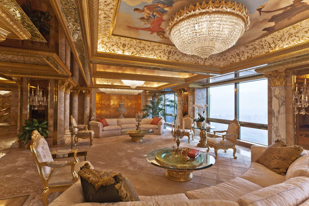 [/img]
Gilt MDF how gauche. 😆
I'm into grey walls and white woodwork with mid century furnishings. Grey sounds dull but it's actually quite a strong look and goes well with the warm brown/teak of cadovious wall units and contrasts with white shelving (I have tomado covering one wall) big prints with bold colours and a few herdwick sheepskins on seating make it feel very warm.
I haven't actually painted it yet as I'm waiting for floor and skirting to be done then I need to get the right grey as it's a north facing room so need a tiny bit of warmth in it and not too dark.
Can't stand white/magnolia, looks like you can't be bothered.
Can't stand white/magnolia, looks like you can't be bothered.
Damn, my interior design approach has been rumbled... That's it - bare plaster next time for the statement 'raw' look.
You can thank me later for that top tip. IANAID....
CFH, he's wanting inspiration for his house, not sure a pic of your shed is going to help.
It can be very difficult with stronger colours to choose correctly as a slight change in shade can make a real difference.
My wife is an artist and we don't have our house in crazy colours but they are always darker and more striking than most boring white/magnolia rooms.
Nothing bores me more now than seeing a typical STW room with a log burner, white walls and a wooden floor. May as well live in an office...
Anyway, my tips from 20 years of decorating our own houses and learning from my wife - she does the colour choosing and I handle the technical elements... :D. This isn't gospel but its what I've learnt and it works for us.
- Don't used cheap paint. Avoid the DIY sheds for paint, avoid consumer standard Dulux/Crown/Valspar etc paint and go to where the pro's buy their paint. We have an excellent decorators centre in Hudds where we have got great advice and help over the years. Yes the trade paints sometimes cost more but they are nicer to use and need less coats. I painted one room in our new house a dark jade colour over a light green and only needed 2 coats. If my technique was better i might have managed 1 coat. I like the Dulux trade range personally but the crown is good too. Macphersons paint has a good rep at my shop too (their eclipse white trade paint is simply amazing, I haven't used better and its so cheap).
- Match the colour range to the age of the house. This isn't a hard and fast rule as if you have a Victorian house which has had all the original features ripped out and you want a minimalist look then anything goes. We've just bought an Edwardian house and we have gone for Art deco/Edwardian style colours as they tend to go well. Various companies do ranges to match certain periods - we have had good success with Dulux heritage range ourselves. farrow and Ball and Little green do some really nice colours.
-dont buy too many testers, but buy enough!!! I hate the little pots with brushed you buy in the DIY sheds - get a proper 250ml pot mixed up at the decorators centre and paint a large area with it. Strong colours can look different in different areas of the room so try it on different walls. Try to narrow down to 2 or 3 colours to go for before buying testers.
- Paint round the windows so you can see the colour against the wood colour, pic below shows how we did this in our bedroom.
[URL= http://i410.photobucket.com/albums/pp187/rcatkin/House%20Renovation/370E75FF-2240-46C4-821A-F6070A6ABF17_zpsmot2fscv.jp g" target="_blank"> http://i410.photobucket.com/albums/pp187/rcatkin/House%20Renovation/370E75FF-2240-46C4-821A-F6070A6ABF17_zpsmot2fscv.jp g"/> [/IMG][/URL]
And it ended up looking like this...
[URL= http://i410.photobucket.com/albums/pp187/rcatkin/House%20Renovation/932D156D-5C0F-4C31-9123-C3807404292F_zpszi6ze90g.jp g" target="_blank"> http://i410.photobucket.com/albums/pp187/rcatkin/House%20Renovation/932D156D-5C0F-4C31-9123-C3807404292F_zpszi6ze90g.jp g"/> [/IMG][/URL]
- dont be afraid to change your mind. If it doesn't work then re-do it. We painted our whole lounge in a particular green as the testers seemed to be great but when the whole room was done it just wasn't right. We tend to find greens really hard to get the right one.....
First color....
[URL= http://i410.photobucket.com/albums/pp187/rcatkin/House%20Renovation/3E66A4E7-B03E-454B-9728-8D43FA1F98C3_zpsjqkljgso.jp g" target="_blank"> http://i410.photobucket.com/albums/pp187/rcatkin/House%20Renovation/3E66A4E7-B03E-454B-9728-8D43FA1F98C3_zpsjqkljgso.jp g"/> [/IMG][/URL]
Too light!
Ended up like this...
[IMG]  [/IMG]
- don't be afraid to copy whats in a magazine or paint brochure. If it looks good in print it might look good in your house.
- I personally don't think you can go wrong with white woodwork against a strong colour. Personally I would stick with white woodwork OR the same colour as the walls as I'm not a fan of cream or differently coloured wood.
- stick with matt or satin paint, brings the colour out more. I personally would never have silk paint - people say it reflects the light better but I think it looks naff.
- dark paint in a dark room can work. Hard to pull off right but the results can be stunning:
[img]  [/img]
- feature walls - hmmmm. Not a fan as its a bit played out, i reckon its a modern trend for people who don't take the time to pick the right colour and won't commit to a whole room. It can work though, but it takes time to match the other walls to work well IMHO
- lighting can make all the difference - in our lounge above we have a couple of standard lamps we use all the time rather than the ceiling light - looks so much better. Light bulb temperatures can make a colour look very different e.g. LED v trad bulbs
- don't listen to anyone else (huh?). Don't go for what is trendy or what your mate has, you are living in the place and what you say goes. If you have ignored all the above but love it that's great! Just bear in mind you might have to break out the magnolia before you come to sell up as you're not selling it to yourself... 😉
Anyway, just my thoughts, good luck!
I like pale colours with bold colour rugs pictures etc. Unless its a period house it always looks like "arty" wife and beaten down husband choices.
I'm into grey walls and white woodwork with mid century furnishings. Grey sounds dull but it's actually quite a strong look and goes well with the warm brown/teak of cadovious wall units and contrasts with white shelving (I have tomado covering one wall) big prints with bold colours and a few herdwick sheepskins on seating make it feel very warm.I haven't actually painted it yet as I'm waiting for floor and skirting to be done then I need to get the right grey as it's a north facing room so need a tiny bit of warmth in it and not too dark.
Can't stand white/magnolia, looks like you can't be bothered.
We used grey in our bathroom which is an Edwardian bathroom and it looks amazing even when the light isn't coming in.
I like pale colours with bold colour rugs pictures etc. Unless its a period house it always looks like "arty" wife and beaten down husband choices.
haha you could almost be describing my wife and I - not offended though. I reckon you are right though - but the ones which don't work are done by the people who [i]think [/i]they are arty but really don't understand colour. It's not easy to get it right but staying away from the bog standard Dulux/Crown DIY brochures is a good start - the darker colours in them are so naff - very "bright" and "sharp" looking in my eyes - like public toilet colours. There are loads of other colour ranges out there which are so much more subtle.
Nothing wrong with plain white walls.
Each to their own Flashy but that looks like an office or laboratory to me.
You've been in my house, molgrips. The living room is the same colour as newrobdob's final green colour (around the 359c range), above, but the chimney wall is deeper green (around the 356c range).
[img] 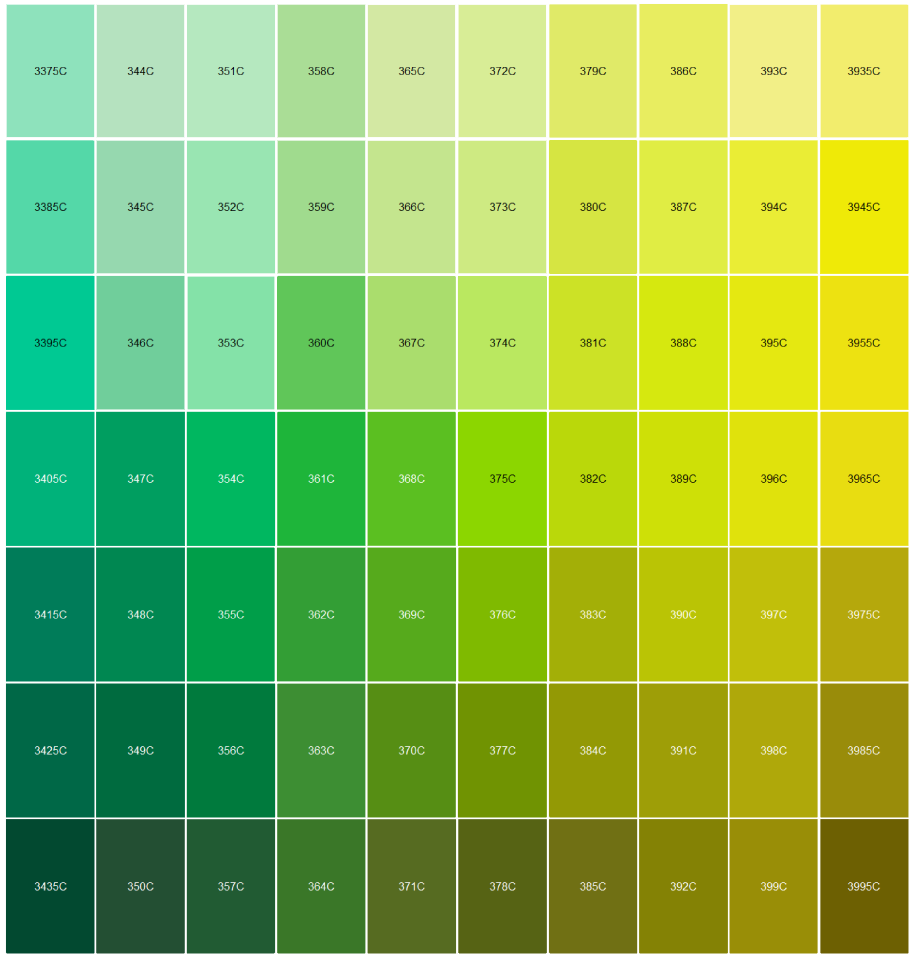 [/img]
The kitchen, meanwhile, is pantone 164.
[img]  [/img]
Colour is always good!
Yup.
Lots of 70's orange, purple and green.
With blue sofas
And a multicoloured rug.
Basically, it looks like the set from a kid's TV show.
🙂
CaptainFlashheart - Member
Nothing wrong with plain white walls.
Absolutely.
I have an art degree (painting) and went through the whole bold colours thing in our first house. Lasted about 3 years before it was doing my head in.
Everything that isn't floor or furniture white. Turn the whiteness up to 11.
we had a bright turquoise living room, and a bright green kitchen in our little 2 terrace
it worked really well, honest!
What's interesting is how the presence of strong colour has completely transformed the place. With not much natural light coming in, and pale walls, pale woodwork, pale carpet, there was not enough contrast so nothing for your eyes to fix on, it all looked flat. Now the walls are darker there's suddenly contrast and the house looks three dimensional. It's a strange effect.
feature walls - hmmmm. Not a fan as its a bit played out
We've got three floors. So two staircases, two landings and a long hallway. That couldn't really be done in all one darker colour, so we've got each floor different with the stairwells pale.
Everything that isn't floor or furniture white. Turn the whiteness up to 11
I lived in a flat like that. It was awful. Really depressed me, the place looked absolutely awful.
I shot in a location house that was white. I mean everything, floors, walls and furniture. It made your head hurt and sunglasses were needed in the summer.
It was horrible.
Im pretty sure Flashy's is 'Bone' White
Everything that isn't floor or furniture white. Turn the whiteness up to 11.
^^This
Hague Blue
End the thread
[img]  [/img]
Wouldn't fancy putting up shelves in this room
we went for shocking ping glass splashbacks in our bathroom - not the best pic
[img]  [/img]
pics also before shower screens installed
Wouldn't fancy putting up shelves in this room
😆
shocking ping glass splashbacks
If it's going ping, you need to see the doctor. Sharpish.
Good spot, Kimbers.