![]() You don't need to be an 'investor' to invest in Singletrack: 6 days left: 95% of target - Find out more
You don't need to be an 'investor' to invest in Singletrack: 6 days left: 95% of target - Find out more
Give is a hand with this one. I need some examples of poor plots and charts of data. Things like 3d graphs where the 3rd d doesn't mean anything, or oil exports as barrels, when it's only the height that matters etc.
Links please.
This sort of thing
[img]  [/img]
[img]  [/img]
Some examples on this [url= http://flowingdata.com/2013/03/01/this-pie-chart-is-amazing/ ]thread[/url]
[img] 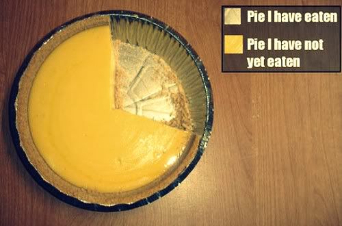 [/img]
this initially tricked me
[img] 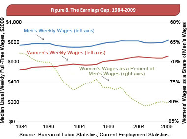 [/img]
search "how to lie with statistics"
[img]  [/img]
[img]  [/img]
Stoner, that looks like an Excel version of this bike route:
[img]  [/img]
more like a weather report IMO 😉
[img]  [/img]
How about the Gettysburg address as a Powerpoint presentation, with all men are equal reduced to a bullet point.
http://norvig.com/Gettysburg/.