![]() You don't need to be an 'investor' to invest in Singletrack: 6 days left: 95% of target - Find out more
You don't need to be an 'investor' to invest in Singletrack: 6 days left: 95% of target - Find out more
This painting started out as an attempt to sort of show the view down a tunnel or mine with a few circles of light leading to the vanishing point around the centre height and 2/3rds to the right.
Unfortunately because I got my paint mixes badly wrong, the yellow floated up to the surface during drying and now totally dominates in an unpleasant way.
I was thinking of low lighting the yellow with a graduated black wash but I am struggling to visualise which direction the graduation goes. Do I paint the yellow nearest the vanishing point darkest and then get lighter on the outside or should it be darkest on the outside and then brightest towards the centre? I hope that makes sense.
If it doesn't work I will just paint over the canvas but I would liek to try and save it if I can. Any other suggestions welcome.
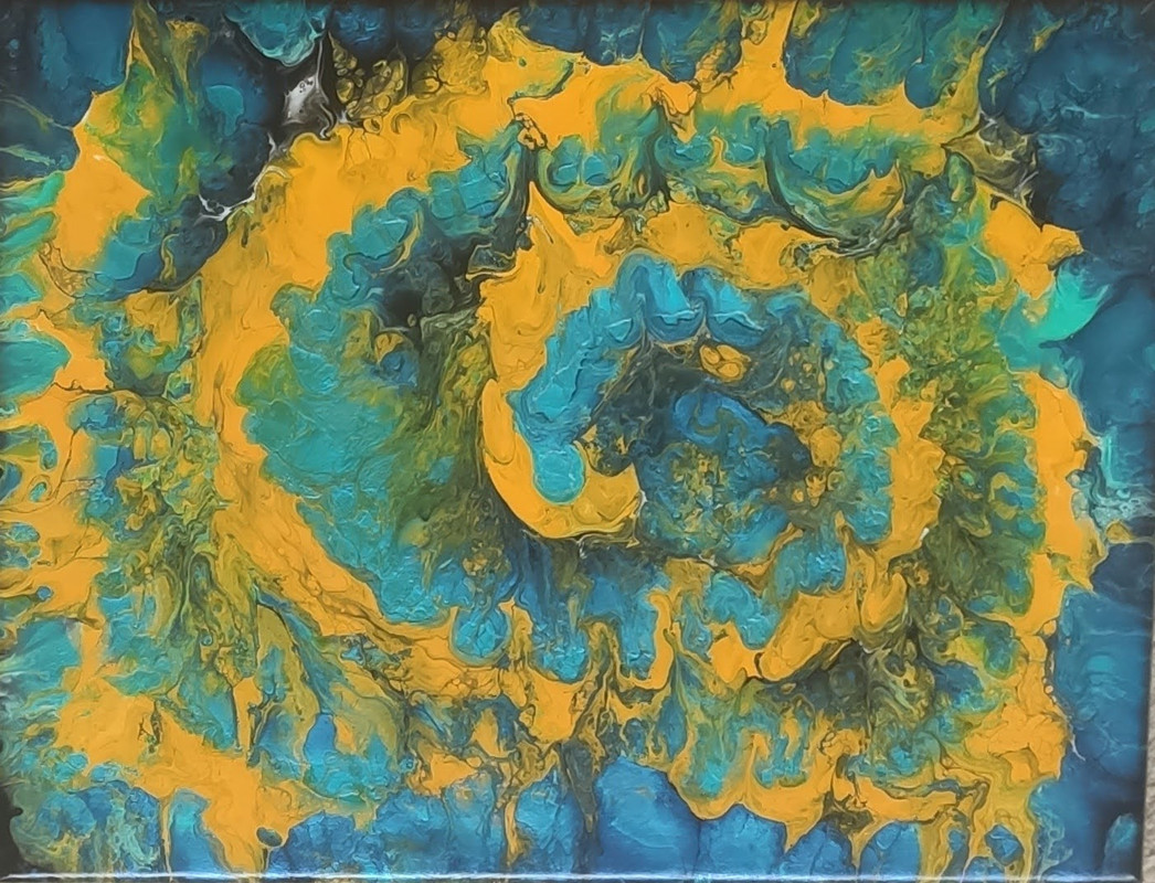
I have tried asking on 'art' forums but mostly you just get people saying Wow!, Lovely or Learn to Love your work rather than actually useful advice
I would do
paint the yellow nearest the vanishing point darkest
Cos, um, your hole is dark.
IANAA
Just talking about colour alone - it will always be difficult and blue and orange (including orangey yellow) as being complementary colours they make each other ‘pop’*
Also, in painting, cool, less saturated colours ‘recede’ (ie distant blue/grey hills) and warm , saturated bright colours OTOH tend to sit well in the foreground. Conversely you have the brightest and warmest mixes in the centre which is where you wish to portray distant perspective? So it works against itself in that respect.
*Complementary colours can work well to create perspective in a design if there are clear lines/edges/reducing scale - leading your gaze/creating a strong optical effect,ie
But the effect would be enhanced if there was also some aerial perspective applied via warm/saturated foreground colours vs cool/desaturated ‘distant’ colours.
So to summarise key elements:
Linear perspective (leading lines/edges/shapes = big vs small scale)
Aerial perspective (hues/tones = warm/strong vs cool/weak)
Lovely
I quite like that and looks like a nice safe hobby
Perspectives are always difficult to achieve if you attempt to apply it in a non-linear fashion
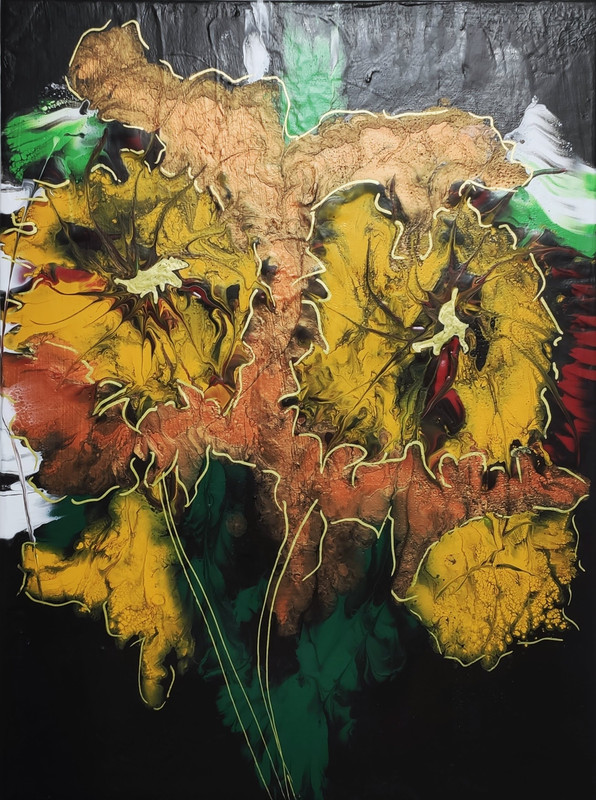
Beautiful flower. 7/10.
Give yourself a sticker.
DrP
p7eaven - Believe it or not, the yellow lines were very thin when it was wet. I was using left over paints which is why the mixture densities were so different.
Originally it was dark across the top of the canvas with a fairly thin arc of yellow light, a slightly lighter section of blue and a thinner yellow arc, another blue section which has dried much brighter than the rest even thought it is from a single pour, a last thin yellow and then the dark centre.
The original blue pour was dark across the top and the right of the canvas and bright on the left and bottom but with a dark area which I chose as the vanishing point.
It almost looked like the view into a tunnel already but I thought a little embellishment with yellow just to highlight the effect... 🙁
DrP - Just for you
Available now to VIP members at NicksArtStuff.com
p7eaven – Reading what you said again about the colours and their relative effects on each other makes sense. I am not sure if you added your image but it didn't appear when I first replied. Perhaps it should be a view down onto a mountain so the colour perspective is in the right direction 🙂
Perhaps it should be a view down onto a mountain so the colour perspective is in the right direction
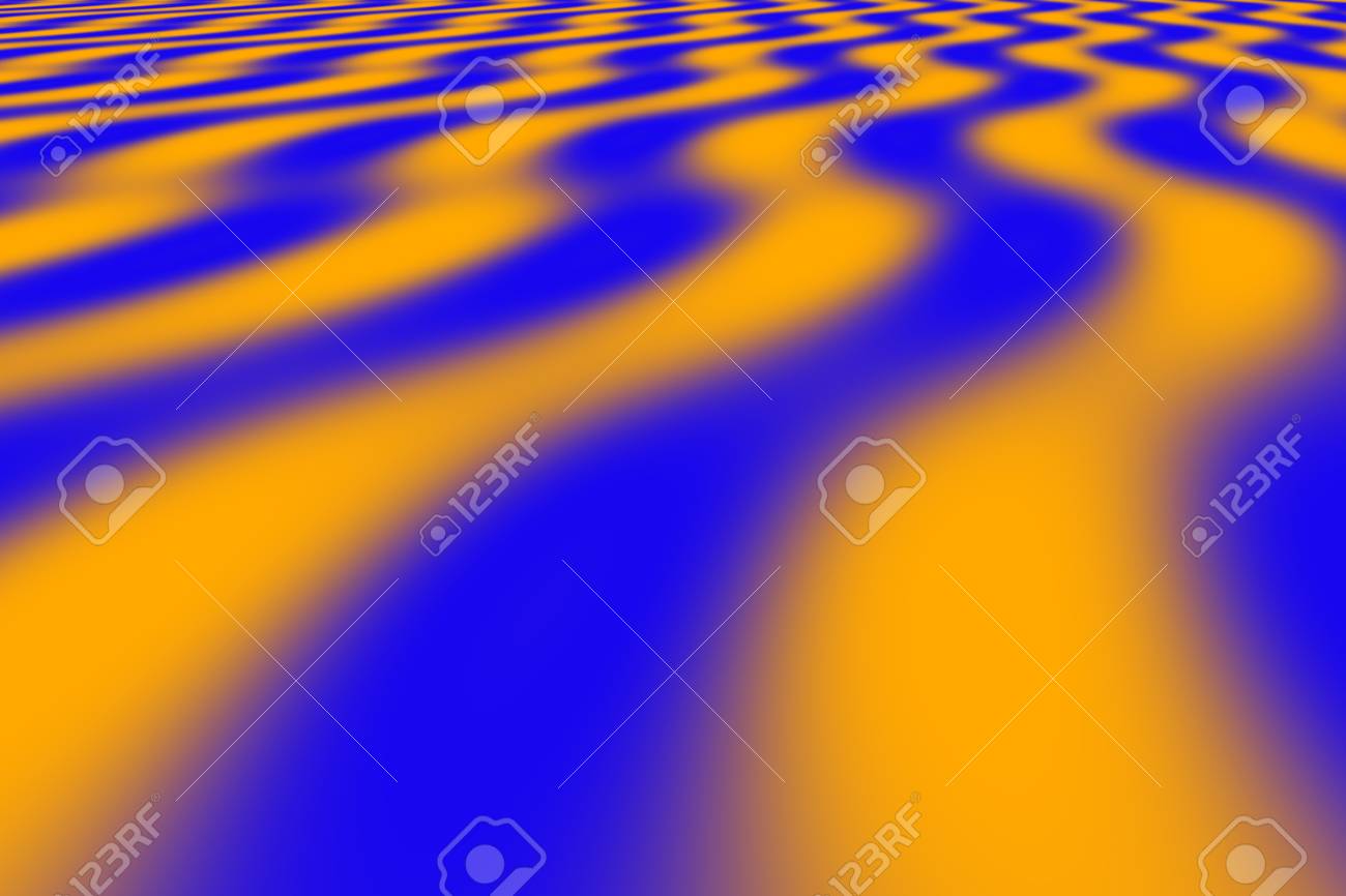
I just did an image search for ‘orange and blue perspective’ to find an example of how complementary colours aren’t necessarily a lost cause for showing perspective. In that case linear. There is no ‘colour perspective’ (aerial perspective) in that stock image, just lines/shapes and two flat colours.
To add aerial perspective someone would no doubt make the background bluer and maybe paler, while keeping the foreground bright and warm.
In the below sketch I used the same principles, as Bredon Hill in the background appeared to be half-enveloped on cold mist with the sun coming through, so it gets the cool blue fuzzy treatment, while the foreground is sharp and especially bright orange/yellow where the sun catches a small birch and bracken, whereas the similar autumn leaves depicted mid-distance are a simple cool, light umber giving way to purples (red/blue ie crossover from warm to cool)
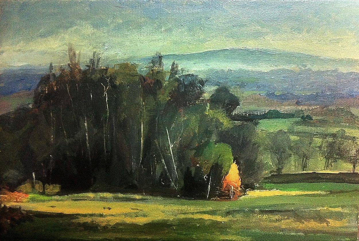
Love the colours in that second one Nick. Best thing I've seen from you 🙂
I'm shit at colours, so always use pencil or black ink.
Thanks DezB - It is called Tortured Blooms. I am shit at straight lines or smooth curves so tend to stick to abstract or semi abstract. If you want to see the latest stuff I am painting it is in the VIP area. Membership is free, I don't bombard you with emails and you get a genuine discount on the paintings if you buy before they go to the main gallery.
Still learning - mainly from p7eaven - where the 'rules' for normal painting apply and where I can flex them more into guidelines.
OP, looking at your painting it (for me) gives the rather nice impression of looking down on a satellite image of some psychedelic spiral-carved mountain rising out of badlands full of exotic minerals. The fact that you intended the centre to be the distant-most (yet it appears to be the topmost) doesn’t matter to me the viewer because I like it how it is! #HappyAccident 😎
What type of paint are you using? I'm guessing oil or household emulsion?
Not only the colours refusing to obey your intention to depict a mine. The texture and form are moving against what you intended too. It looks more like a spiral ridge on a flat surface. You probably want form and texture to guide the eye toward the vanishing point. The banding of the colour should be widest and the outside and closest at centre.
Disclaimer: I've tried to sound like I know what I'm talking about as I studied fine art... but not made a painting for ten years.
I like happy accidents but I don't like that painting so I will probably practice adding water droplets or something else to distract me from the yellow.
The paints are proper art acrylics mixed with Floetrol to extend them and a little water to dilute. The trouble with this one is I had completed the blue pour which worked well and then had some yellow left from previous piece and thought "If I just add a dash of that..."
Perhaps it should be a view down onto a mountain so the colour perspective is in the right direction
Sorry WCA, just realised you were referring to your painting, not the imgstock one I posted,doh! Yes, agree! (See my prior post)
That’s lovely. You should learn to love your work.
[i]That’s lovely. You should learn to love your work.[/i] - Strangely familiar. Are you sure that is your own original thought 🙂
As previously discussed....I've never had an original thought in my life.
[i].I’ve never had an original thought in my life.[/i] - Your not the first one to say that either 🙂
I think you should draw a tunnel or mine outline in black on top of that painting.
Do you know if you have an original thought? What is an original thought? Does it have an origin?
Do you know if you have an original thought? What is an original thought? Does it have an origin?
Yes, it was my thought and therefor the origin of the thought.
Check with your latin and greek tutors for a better explanation 🙂