![]() You don't need to be an 'investor' to invest in Singletrack: 6 days left: 95% of target - Find out more
You don't need to be an 'investor' to invest in Singletrack: 6 days left: 95% of target - Find out more
[center][img]  [/img][/center]
The graphics man should be shot surely? White is nice but the front end graphics are shocking no?
Pay peanuts get monkey designed graphics.
Generally considered a matter of personal preference.
NEXT!
Cynic-al yes I am aware this has been discussed to death but this seems to be a final design in white? I saw much nicer decals on the selections posted on theire website before?
actually I rather like that, much nicer than the current black with black decals one
I quite like it!!!!!!!!!!!!!!!!!!!!
It gets my vote too. simple is good.
I love the plain carbon inside the rear triangle.
Thats really really nice. Less is more etc
Generally considered a matter of personal preference.NEXT!
+pork chops
yep, thumbs up from me - I like it.
OK just me then.... [retires gracefully]
I'm not mad on that headtube graphic either, but if they put the price down to £399 again I'd still probably buy one.
really nice IMO, and the graphics save it from needing a headtube badge, all in the weight saving init!!
Not just you, i dont think it looks great, but compared to other brands they haven't got much to work with logo/font wise. The placement is ok, just the font and logo are a bit...basic.
Still if stuff like that adds to keeping the price low and allows people that want a carbon hardtail to buy one that otherwise wouldnt/couldnt then i guess thats the point isn't it???
Backa again 😉
[img]  [/img]
[img]  [/img]
[img]  [/img]
[img] 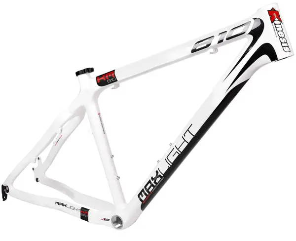 [/img]
Like these better - However the price tags are greater granted 😉 I wouldn't refuse a 456 - I'm not knocking it just though the front end graphics look like someones put a decal on wonky 😉
[retires gracefully again]....
I suggest all those who have systematically pooh-poohed the CF 456's graphics since day one have a pop at designing how it "should" look. I bet 99.9% of them would look like they were drawn by a foetus.
FWIW I think they look pretty sweet.
OP: "I don't like this"
Rest: "We do but also don't really cares"
Or am I missing something.
Rich, did you see 'my' 19 at the weekend?
Yummy
Its only a comment The Flying Fox - I know I could design better graphics 😉 that [b]I[/b] like 🙂
No Gary unfortuantely but it does look a nice bike on the site 🙂 V Jealous 🙂 TBH I like the look of the Whyte 19 more than the KM-810 [stunned] 😉
That Whyte is lovely!
There were much better graphics in the 'you decide' On-One 456 page.
There were much better graphics in the 'you decide' On-One 456 page.
in your opinion
There were much better graphics in the 'you decide' On-One 456 page.
in your opinion
In your opinion 😉 - This is a forum so most posts are peoples opinions 😆
white 456 looks great IMO
I think the graphic there is genius - saves on ugly 'copter tape
That frame looks even worse in white, erm, in my opinion of course.
The bottom bracket junction, head/top/down tube junction and the chainstays just look too large & blobby.
I suggest all those who have systematically pooh-poohed the CF 456's graphics since day one have a pop at designing how it "should" look. I bet 99.9% of them would look like they were drawn by a foetus.
The graphics are borderline retarded. However, of course i couldn't do better.
Likewise, just because Big Brother is a better TV programme than i could produce doesn't mean i want to watch it.
I think it looks superb - bike-wise, that is.
I like it, although in my view the frame is hideous anyway. Is the wraparound graphic not just a copy of what charge bikes were/are doing anyway.