![]() You don't need to be an 'investor' to invest in Singletrack: 6 days left: 95% of target - Find out more
You don't need to be an 'investor' to invest in Singletrack: 6 days left: 95% of target - Find out more
Am getting a new 853 gravel frame put together by Rourke, will hopefully be time to choose the paint soon!
Am going around in circles trying to decide how to have it painted. Part of me thinks I should just go simple as I don't trust myself to come up with something tasteful otherwise, but I can't resist the urge to get something 'unique' done.
Staring at my whisky collection last night I realised that my favourite branding is the Laphroaig bottle/box. It's simple but seems to resonate with me, but I also loved the blue/orange combo on my Talisker 10yr old.
So I came up with this. I love it, which I think is what counts, but am not sure if Mr Rourke can colour match (or better yet, would love it if he could match the Laphroaig font...)
Have I broken any fundamental laws of graphics design? 😎

Haha, I love your thinking.
I once tried to design some club jerseys with the Laphroaig colourscheme & font but was overruled because it was too classy.
Personally I'd stick with one or the other (definitely the Laphroaig) but as you say...
I love it, which I think is what counts
Yeah, would be hard to mess it up that way, just green bands top and bottom of each tube.
Could maybe just reduce the volume of blue, e.g. a small patch at the front and rear dropouts only...
I'd stick to a single malt and just go Laphroaig. Save the Talisker colours for another bike!
The green bands would look amazing with a thin gold line around the bottom of each one if that was possible. Perhaps make the bits at the bottom of the forks, tubes around the BB and stays the dark green of the lid/base of the tube the whisky comes in?
Rourke name in a similar typeface would look great if they're up for doing that. Can't find a perfect match but a tall serif font would work. Maybe Perpetua with a little bit of tweaking to make it less squat. If the 'R' and 'O' work that'd be the main thing.
Again though, as long as you love it that's all that really matters.
OK, comments noted, I think deep down I'm happier with this, the Talisker blue and orange was me effectively still giving in to my magpie tendencies, which I've learnt I need to restrain somewhat.
Had a nice chat with Wayne @ Rourke, sounds like he is definitely on board with a themed paint scheme, and as luck would have it Laphroaig green isn't far removed from British Racing Green anyway.
He can do the gold pinstripe and might even be able to use photoshop to generate the Laphroaig font, with which to create a stencil for vinyls or masking.
Just up to me now! I think I might play with fattening the bands a little but otherwise it's getting close.

Hmm....

Both look good but the green lines pip the post for me.
May as well paint it turquoise and bright green ;0)
[img]  [/img]
Haha, I'll peel the label off a bottle and put it on the seat-tube instead of the 853 sticker 😎
Heh!
Good decision sticking with the Laphroaig colours.
I'd probably go for something in between the two samples, but maybe ask them to come up with a suggested design - I work with designers a lot and they usually improve my half-baked ideas.
Of the two latest ones, the one with more green is my favourite. The other is a bit Dunlop tennis shoe.
The second one, more green and some gold bands works for me...
but I can’t resist the urge to get something ‘unique’ done.
So, my thoughts are this subject are that bicycles are a really bad canvas to paint fancy scheme on as they're mostly pretty skinny tubes, and most complex designs aren't really designed for tubes, and it won't look great. This is something presumably you're going to keep forever? (or least a while). don't get a fashionable scheme that in 18 months or so is just going to get on your nerves. Likewise, a solid colour that you like now because it's fresh and interesting is going to wear pretty thin when some marketing executive also thinks so, and uses it as the Waitrose colour palette update.
I would look at adding extra pinstripes either side of the colour bands to help ‘lift’ them - did it with some WC bands on my Colnago and it looked fab - looks good on skinny round tubes.
The question is, are they going to build in a little cylinder inside the down tube with a wee tap under the BB for’supplies’ 😉
The one with more green and the gold bands is the winner for me. And if you can get the Rourke branding in the same green with gold outline on the letters then all the better.
May as well paint it turquoise and bright green ;0)
🙂
I’ll peel the label off a bottle and put it on the seat-tube instead of the 853 sticker
That would be such a nice touch I couldn't quite get it out of my head and just wasted half an hour of my life on this.

Whether it'd be allowed if you're an authorised Reynolds builder or whether you'd want to go for it over a standard 853 badge is another matter.
Brilliant!
Maybe add “Smooths trails fights the blues”
Definitely the one with more green, bike would be a real head turner.
That 853 design is very good!
Love your work debaser! 😆
I'm not going to all this effort and expense though NOT to get my first ever green and yellow 853 sticker though 😉
Brilliant... love this. Not the result, just the whole idea so far : )
I think I might play with fattening the bands a little but otherwise it’s getting close.
Bands are easy to get wrong on a frame when used on multiple tubes. They're often too fat and widely spaced on the stays if they use the same proportions as the main tubes. Proportion is everything.
Less is more for a design like this imo. Bands should pick out tubes or help with the visual centres of tubes (aligning with or offsetting the centres, your call). Be careful with using the tube lengths to position the bands rather than looking at the complete bike ie where rims+tyres and chainset outer edges sit.
By not having a band on every tube you highlight the ones that do. eg, you wouldn't have a band on the head tube so there's no rule saying you need them on any other tube, just the DT and ST are most common.
I think a band on the upper ST and one on the lower fork balances well with decals/text horizontally aligned across the front of the seat tube just below. This of the ST as the bottle and balance at the front end / fork.
Have I broken any fundamental laws of graphics design?
I think that's how it should be for generating themes and concepts, then fine tuning the ideas with a sense of balance, proportion and colour theory will get you a better result. Or start with the balance and figure out ways to achieve it.
So, my thoughts are this subject are that bicycles are a really bad canvas to paint fancy scheme on as they’re mostly pretty skinny tubes, and most complex designs aren’t really designed for tubes, and it won’t look great.
Agreed. ie Gulf paint scheme bikes alongside the original Porsche designs. Some of them look ok in their own right as a colour combo but imho they don't work that well as a design homage.
I'd have it green with cream accents and a cream downtube section with the name in green, also ditch the select its poor go with qc or better still 10cs 😉
That 853 hybrid logo is genius. Chapeau!
[url= https://i.ibb.co/pXtTypj/laughroiag-pdf.jp g" target="_blank">https://i.ibb.co/pXtTypj/laughroiag-pdf.jp g"/> [/img][/url]
A bit minimal perhaps but a chalk white with a green band and text aligned and weighted like the bottle sleeve on the ST could look good as a frame decal design, aligned with ~1/3 of the fork blocked in that green.
chalk white
That's interesting, Rourke suggesting a Pearl white which I felt wasn't 100% faithful to the Laphroaig branding but I figured something Matt or chalk finish would just look grubby quite quickly.
Thanks for the input on design, do find the design above a wee bit *too* minimalist but will try play with something in between.
I don't think Rourke do custom decals though so the seat-tube will just be 853/TCP logos I think! 😎
This is what I chose for my Rourke several years ago.
I've got a new 853 road frame coming in a few weeks time. No bands this time but the inside of the fork blades have a accent colour as does the top of the top tube.
I think Jameso is on the right track for your scheme. Too many bands can look fussy. Also remember that the frame is not 2d, even though the tubes are skinny the design doesn't have to wrap around the tubes.
I meant an off-white gloss rather than a pure white - chalk may not be right, but not pure white, more paper white. Definitely gloss.
Thinking about the bottle colour balance, a fine metallic bottle green paint with white panels and black text could look good. Green bikes aren't as popular as they should be.
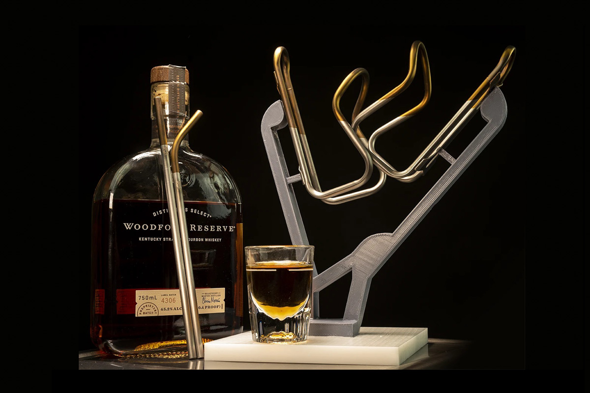
Oh dear, I almost accidently took a pair of Silca bottle cages to the checkout in my LBS until my spidey senses kicked in and I checked the price.
Now they've got a set anodised in a 'Bourbon' colour scheme 😎