@eatmorepizza eventually sold mine a couple of years ago after it sitting unused for 5 years. A guy in Latvia bought it, sorted the shipping out and everything!
Aren’t we used to that now though? Wide downtubes on ebikes just look normal to me now, where as they used to look incongruous.
Might be used to it but still looks terrible. The first manufacturer to make a properly pretty E-Bike will clean up.

Any of the latest Banshees
Anything Steel/Tubular
Actofive
Not a fan of the banshees - same as a lot of the Ibis bikes - the DW link style suspension makes the rear triangle sit too low vs the top tube and something about the extra support between top tube and seat tube looks odd to me.
I still think steep seat tubes with slack head tubes looks weird. Like you've bent the bike upwards by the wheels. Might ride well, but they'll never look good.
@aidy - I agree - particularly on hardtails but some full suss too. Some of the Sick bikes they made looked properly squashed in the middle.
I've just ordered a M/L Aether 9 Shimano
Build. Its not a bad looking bike, it's definitely better looking then my old Sonder Evol 2018!
Got to wait a for weeks though as the frames aren't in the country yet.
But I'm very much looking forward to getting back out on the trails with my new sled!

Might just be me but horizontal shocks always look nicer than vertical ones. Any that are attached to the top tube are an affront to the MTB gods.
Care to offer one?
Literally not a single good looking bike in this entire thread
well done
Come on then, knock us dead with your suggestions....
We're not deserving of its beauty.
I'm just here to judge
I do like the look of the spur as it goes.


What about a Liteville 301, always liked the look of these.
Anything with a shock that looks like it is waiting to castrate the rider at the slip of a pedal is a no from me.
How much you fancy riding one isn't a strict factor in bicycle prettiness imo, but yeah, that Liteville looks like a bike had an unfortunate run in with a scissor lift.
You don’t look at the mantelpiece… etc.
That is why I always insist that anyone I ride with has a beautiful bike. I don’t give a stuff what mine looks like.
Might just be me but horizontal shocks always look nicer than vertical ones
Very tired, meant the other way around. Vertical shocks just look nicer to my eye. Like they’re supposed to be that way around. Horizontal looks okay on industrial bikes like Orange and Curtis.
Just to add, I do think Mondraker make some of the best-looking FS bikes, e.g. this Foxy:
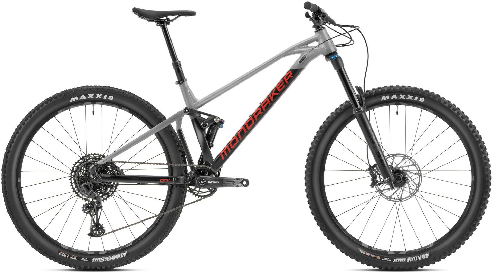
The straight line from top tube to seat stay helps, but they also look positively svelte next to a lot of current bikes with chonky-BB areas and downtubes.
That's not bad looking at all. Let down by the rear triangle arrangement that makes it look like it's fouling the tyre, and the curved top tube.
Carbon version looks better.


Literally not a single good looking bike in this entire thread
well done
I think you can make a reasonable argument that as soon as you insert a shock. and associated gubbins into a frame, it becomes inherently cluttered and lacking in the sort of graceful simplicity that makes for a classically good-looking bike, It's a kind of gazelle versus hippo thing... Or one of those weird, gas-lighting TV ads where brands try to convince you that their latest SUV is a svelte object of desire.
It’s a kind of gazelle versus hippo thing
Personally, I'd rather shag a hippo 😀
Didn't Transition used to have horizontal shocks? I thought they looked better then.
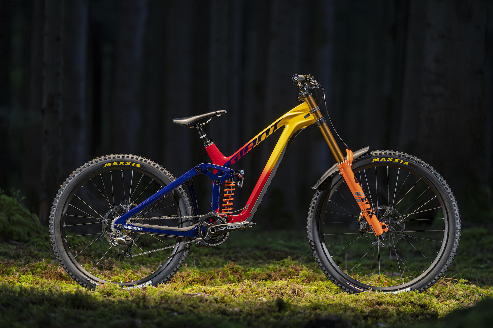
He may get bored with them quickly, but Weeksy has had some nice looking bikes. I'd give the Slayer a good going over
[img] 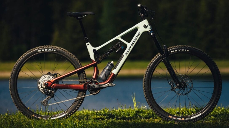 [/img]
and the Status he's posting up now, appeals to my hippo lovin eyes. (Apart from its flesh being a touch too pale)
That Slayer is an awful looking thing!
That Slayer is an awful looking thing
And weeksys wasn't as nice as that one 🤣
Sorry weekst 😉
The brace/shock mount does it no favours
That Mondraker looks nice apart from the extra bit in the rear triangle. Anybody know why the hell it’s there? Just ruins what would otherwise be a very nice looking bike.
You taking the piss @tomhoward? 🤣
Even down to the fact that they've written 'pull-shock' on the rear triangle 🤮
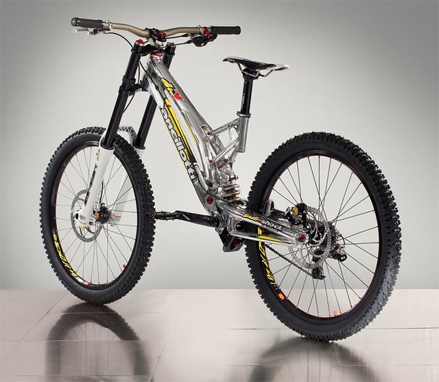
Glad to see Ancilloti back with a new bike. That looks really good, you know, as a bicycle, to actually ride. Not whatever messed up criteria people are judging everything else by.
[img] 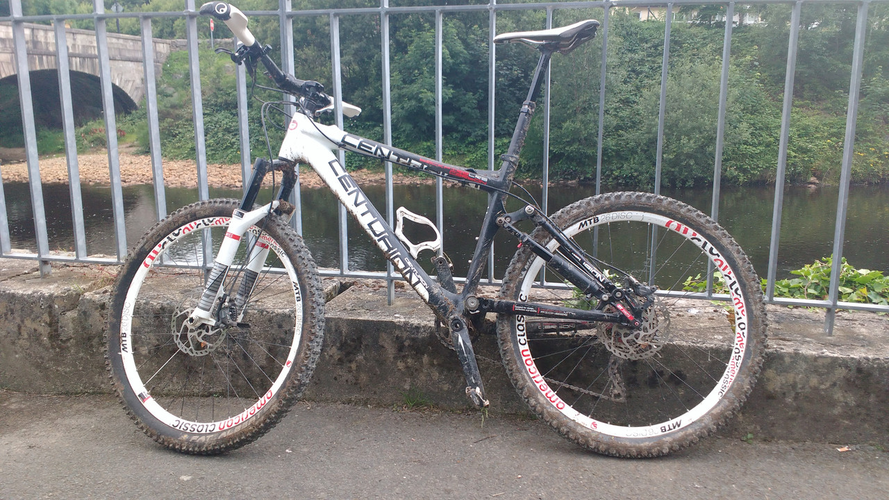 [/img]
Of it's time but it always drew my eye in a good way.
That Slayer is an awful looking thing!
Functional at best, I'd say.
That Mondraker looks nice apart from the extra bit in the rear triangle. Anybody know why the hell it’s there?
IIRC it's a cross brace for the rear end.
Edit: It's the vertical part of the rear triangle, and goes either side of the tyre. You can see a bit better here: FOXY R (mondraker.com)
+1 for Ancillotti. I always thought the tubular frame and polished Al looked great.
The brace between top & down tube for the shock mount on the slayer is definitely an eyesore as is the hideous colour scheme that literally goes with nothing, there isn't a fork available that'll look good on that thing.
Not keen on the straight line thing tbh
I Like the Ancillotti's up there.
Stumpy Evo
Santa Cruz
Evil offering
Current fetish is overbuilt xc bikes.
Dropped top tube, contrasting rear end, quirky klunker style for the win.Trail razzer rather than mile muncher but my view on looks changes like the weather. Never been keen on orange full sussers though🙈
I’ve never got the love for Evils looks tbh, but to each their own.
Apart from the imperial hardtail from the 00’s
Even down to the fact that they’ve written ‘pull-shock’ on the rear triangle 🤮
They always did that, it was a reference to the linkage under the BB that is 'pulled' by the swingarm to actuate the shock, hence "pull shock". I quite like old and new Ancilloti both aesthetically and functionally.
They always did that, it was a reference to the linkage under the BB that is ‘pulled’ by the swingarm to actuate the shock, hence “pull shock”. I quite like old and new Ancilloti both aesthetically and functionally.
I know what a pull shock is.
Writing it on the seat stays though is the equivalent of a '5 speed', or 'ABS', or 'Turbo' badge on the back of a 1.3 Astra
Nice to log into STW for the first time in a few days and find out you own the worlds nicest looking FS 😉

Writing it on the seat stays though is the equivalent of a ‘5 speed’, or ‘ABS’, or ‘Turbo’ badge on the back of a 1.3 Astra
I find it hard to fault for that alone, that's pretty prevalent in mountain bikes (dw-link, fsr, etc.). They could have done it a bit less garishly, though.
I can never decide whether Ancelotti bikes look like amazing works of art, or remind me of cheap BSOs.
Maybe both can be true at the same time. The yellow stickers don't help though.
Nice to log into STW for the first time in a few days and find out you own the worlds nicest looking FS 😉
Not with that bottle cage and light you don't
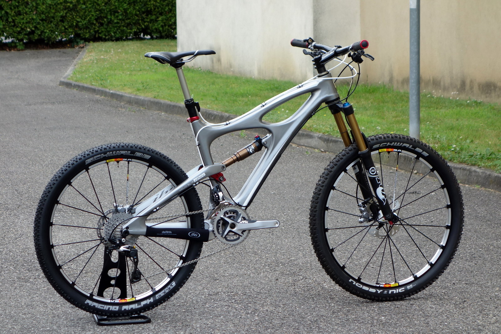
The original Mojo SLR in liquid silver is still very pretty to my eyes. The liquid silver highlights all the details of the carbon from the original topology optimisation which gave it its shape. Lovely. It's one of the few 26ers which looks really right. It also highlights how much internal routing really does tidy up a bikes lines.
Not with that bottle cage and light you don’t
You missed the saddle *puking emoji
Oh and the horrendous amount of dropper to collar out of the ST 😉
Q. Good looking full suss bikes?
A. No
You missed the saddle *puking emoji<br /><br />
My ladies bottom doesn’t care about aesthetics 😜
Oh and the horrendous amount of dropper to collar out of the ST 😉
My bikes suffer from this too
seat tubes designed for stumpy legged/long torso people, or those who wish to size up for more reach, mean its unlikely I'll ever get a flush collar unless with a very long post on a straight seat tubed hardtail.
As a lanky person, the perceived beauty aspect is usually centred on a medium or large. XL or XXL bikes always look shite, in my opinion. It's a funny thing.
oops forgotten how to post pics

You missed the saddle *puking emoji
Saddle is fine. Valves not being lined up, however...
Not whatever messed up criteria people are judging everything else by.
Full suss bikes they think are good looking I'd imagine?
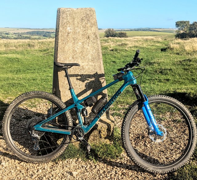
That modern Ancilloti looks decent to me tbf, as does the latest Transition to grace the thread. Pretty sure the Mojo looked ace at the time but the years (and geometry) have not been kind.
Can't get on with the top section of the Cotic rear triangle, especially around the seat tube and shock. Looks like a BSO.
i always loved the look of the ibis bow ti bike (i tried adding a pic but the pic link was weird when i tried to link it for some reason).
It’s a pity Ancilloti don’t have a UK presence - I tried & tried to buy one direct but they couldn’t be arsed to reply to either emails or Facebook messenger. The French dealer (Nini Adventure) had a stand at this year’s Megavalanche & they’re just stunning in the flesh. The Nini guy was a real nice fella & would’ve bent over backwards for me. He did suggest a riding holiday near is HQ in Annecy whereby you could bring a bike from the UK, & return with a bike (that may be slightly more polished with yellow stickers), to help with post Brexit funding 😂.
Capra looks ok .. for a soul-less carbon CAD station product ; )
(more than OK I'd say.. quietly and off-record)
I think for me it boils down to two triangles with a nice unbroken line through the toptube and seat stays with a barely visible vertical shock and mount. So basically a steel or Ti HT 😂
That or something that resembles a grumpy tractor.
I don’t like it when extra bits are added to the triangles. That Capra could look alright without the shock basket.
Not with that bottle cage and light you don’t
I can beat that 🤡

For me anything with external cabling is a no no .
I do like the Santa cruz lines and the cleanliness of the Bold /Scott bikes but like most the lines on the Transition Smuggler are one point as are the colours. High pivot bikes hurt my eyes. I think a lot of people are drawn to colours before style.
Just to pile on about that otherwise lovely looking Transition, doesn't that hefty deore cassette go against the lightish nature of the bike.
I've always liked my Canfield, which for a 230mm travel DH bike with idler has simple lines and some nice bits of CNC. Anodised finish still looks good 15 years later as well.

@noeffsgiven sorry I should have gone for the higher spec build! As it is that bike cost more than my car 😅
Fork needs to be boxxer red…
Those orange Fox forks have ruined so many nice bikes eh
DHO red...
Showing my age!
My antique Kona. Sadly stolen these many years.

I like the way the seat stays are where they’d be on a hardtail.
I like the straight tubes as well. It looks purposeful. Perhaps the mud helps. I have a Giant NRS now and it never looked right until it had some mud on it. Then it looked proper. It’ll never be as pretty as the Kona though.
I like the way the seat stays are where they’d be on an old fahioned hardtail.
FTFY 😉
It’s one of the few 26ers which looks really right<br />
It really isn’t.
I think generally bike looks are more dependent on geo than wheel size, but on the whole I think 26ers looked better. 29ers too often look like they're a tiny frame suspended between giant wheels.
Does depend a lot on frame size though, very large frames on 26" wheels does look odd.
29ers too often look like they’re a tiny frame suspended between giant wheels.
They did when they first started being a thing, not so much now. Most 29'ers tend to look well proportioned now I think
“ For me anything with external cabling is a no no”
Aha, so it’s all your fault!
