Commencal bikes always look good. The various Meta bikes are pretty awesome looking although the Tempo is a bit fugly + through headset cables yuech. I can accept a bent/curved downtube but toptube just looks awful especially anything with an horrid weird hump/bend near the headtube junction.
Swarf Contour is nice above.
Transition have it bang on at the moment - I love the look of my Sentinel Carbon - but also the alloy one I had looked good.

Ive also got a thing for the Forbidden Dreadnought and the new Druid - although too much bike for me on the Dreadnought front sadly.


I used to think my Stumpjumper Evo was a good looking bike, until I got my Ragley Marley.
There is definitely something about having straight tubes that align. Having top tube and chain stays on one line definitely helps.
If it’s a vertical shock then it needs to be as close to parallel with and not interrupt the seat tube.
Colour can help massively to accentuate the nice lines and hide the messiness.


This is Arsene Wenger ''Everyone thinks they have the prettiest wife at home' territory isn't it? I'm quite partial to my FlareMax, partly because the mad orange glittery paint is gorgeous. Most carbon full sussers look a bit meh to me, steel tubes are nicer, unless the frame's some sort of extended XL modern gate thing, in which case they tend to looks spindly and wrong. Most frames look nicest in a medium...
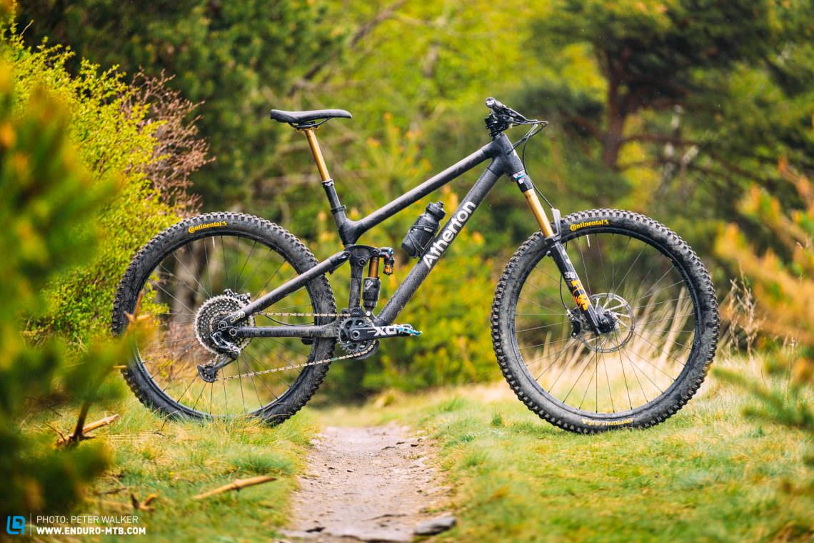
i quite like the Atherton stuff as a sort of mix of what's right from both ends of the spectrum and the Pivot proto that Bernard Kerr rides too, similar aesthetic. I think I preferred the raw ti joint sections, but hey, it's all subjective no?
I think the straight lines of the current Transitions make them look good. My only real issue with them is the quality of the frames isn’t aligned with their vastly expensive selling price. Which is why you can get them a bit cheaper, second hand.
And thats from someone with a Spur in the garage (albeit my other half’s bike now).
Stumpy Evo, minging with the side arm on the frame. If it didn’t have that, similar to the new SL, then it would be an improvement.
Can’t get on board with any high pivot bike ‘looking pretty’. Functional yes, pretty absolutely not. Qualified to comment, as my other half also has a Claymore, which isn’t a looker & I have a HB916, which is no oil painting either 😆
I find myself looking at some of the bikes and half-agreeing with he comments on the straight line between top tube and rear triangle; it's a pleasing thing to my eye and so I find myself drawn to that. The Transitions above please in that respect.
One thing that does grate though is the lack of parallelism(?) between fork/headtube and seatpost tube. Too slack in the head tube and the bike (to me) looks like it is going to collapse, too upright and it just looks odd. That is, I think, the reason that the Smugglar is not an object of desire; my eyes think it is subtly "off".
The same with weird angles, extra bits of material or shapes. I want a bike that looks smooth, clean, neat. Possibly with some subtle curves rather than brutal straight lines and sharp corners. As an example, I used to want a Bronson. It was more bke than I would ever need, but it ticked _that_ box. The latest model just looks a bit wrong though. It's gone "sharp edges" and it has lost its shine.
Oddly, I look at motorbikes and all that goes out of the window. The Ducati 1098 ticks every single box on the list of things I like and is very much an object of desire.
Thanks for all the replies. Plenty fall in to the perfectly acceptable without being 'wow' category IMO. Looking at the first Swarf, Raw and Nicolai. The Pivot, Airdrop and Rocky Mountain suffer the same fate as a down tube that curves 3 meters from the bottom bracket will never look good, even if the rest of the bike does.
I really want to love the Hope bikes and might get one if my preferred choice go under but the down tube makes my teeth itch. Atherton, seat tube.
Unpaved is nice in a 1996 Fat Chance Shock 'a' Billy vibe, the Reeb looks well, as does the Swarf Countour.
Still struggling with the 'Orange single pivot is out of date' line when the vast majority of bikes posted up seem to be a variation on the Horst Link that's been around since pretty much the start though.
my orbea occam looked great, just a shame it was badly designed and the rear triangle has wobbled since 2 weeks old, new bearings fix it then it goes wobbly again
orange have never done it for me. and i'm less than 10 miles from factory.
chatting to a mondraker lady up on cutgate at the weekend her XC full sus (possibly a Raze carbon) looked very very nice.
The straight line and clean looks is why i loved the Status i've just picked up
[url= https://live.staticflickr.com/65535/53454904758_188c747d6d_b.jp g" target="_blank">https://live.staticflickr.com/65535/53454904758_188c747d6d_b.jp g"/> [/img][/url][url= https://flic.kr/p/2prCmQW ]s-l1600[/url] by [url= https://www.flickr.com/photos/152318156@N08/ ]Steve Weeks[/url], on Flickr
For me, it's uncluttered, clean, correct lines.... That's what makes it a good looking bike to me.
The straight line and clean looks is why i loved the Status i’ve just picked up
When people are saying straight line, it's more a continuation of the top tube into the seat stays
That said, the Status looks ok though, just not in the same league as the Transitions etc
When people are saying straight line, it’s more a continuation of the top tube into the seat stays
I get you...
One thing that does grate though is the lack of parallelism(?) between fork/headtube and seatpost tube.
Yeah, but I'd rather have function over form and have a bike that rides better instead of a steep HA and slack STA like bikes used to have. I agree it doesn't help the looks though: 61deg HA and 76deg STA just looks wrong here but rides beautifully.
When people are saying straight line, it’s more a continuation of the top tube into the seat stays
Only really possible with smaller-sized frames. Not (m)any XL-sized frames that I ride that have a TT that slopes that much to align with the seatstays.
Weeksy - how many different bikes do you own/have you owned in the last 5 years?!
Struggling to keep track 🤣
Without a doubt
Weeksy – how many different bikes do you own/have you owned in the last 5 years?!
1-2 i think... i don't really change my bike
😀
All the Transitions look nice. Also, it's a good thing they are now out of stock in my size or I would have pressed buy:

And
Where does gopping come from? Seems to be a forum favourite word but I don’t think I’ve ever heard it in the real world.
We use it all the time in our family. Might have been military in origin.
My sb6 always seems to be the bike that gets the trailside "that's a nice looking bike" comments wherever we are riding so I nominate that...
1 no curvy top tube
2 top tube perpendicular to headtube angle (or rather, the angle of the fork stanchions, so you can apply this same rule to rigid bikes)
3 front triangle looking beefier/more substantial than rear triangle and linkages (appreciate this one is a bit subjective)
Stumpy Evo, minging with the side arm on the frame. If it didn’t have that, similar to the new SL, then it would be an improvement.
I think it's better in real life than it looks in photos. I also think it looks better than the older model or the current Stumpjumper because it's got a straight top tube.
No excessive swoopy, curvy tubes, they must be horrible to engineer and make bikes look like either a hunched back or a dog s***ing.
Chunky, but not excessive, you won't confuse it for an e-bike, but you're not wondering how it'll flex before you've even set off.
Reinforced, so there's nothing that makes it look like it's about to snap
TT/SS parallel
Forks and seatpost parallel (it's not impossible, just needs the seatpost moving forward at the BB to get the offset)
Suspension is obvious, you shouldn't have to squint at it for 5 minutes in the car park to get your head around which way all the links move.
Adding a bottle doesn't ruin it either visually or practically.
. I don’t have the Orange any more, but I do have the 575
You weren't riding at Rivi yesterday were you? Saw a fella on a silver 575 and remarked on it.
Personally I find it difficult to get too excited about any swoopy carbon framed MTBs, they seem so generic and interchangeable. Transition are probably the most handsome though.
Also struggle with most high pivot bikes' looks, though Deviate are quite nice.
Yes I am partial to a single pivot - owning an Orange and Starling and thinking both are very attractive.
There seems to be an increasing number of basic, often raw, alu 4-bar frames which are quite appealing. Airdrop, Raaw, Privateer etc. Can't quite put Bird in there (despite owning one) because the frame shapes are just a bit too generic.
I’m not sure I trust my own opinion anymore because unless the geometry looks right then I don’t like how it looks - very much a case of function defining if form appeals!
But on the whole I like straighter skinnier tubes, raw alloy or bright colours, and no weird bends that make little sense.
The Transition Spur is a super nice looking bike. Same with all of Transition's ones actually - I like the angular sort of tubing style they have.
OTOH I have never liked Orange bikes to look at personally. Always thing they look like an industrial crane or something.
I know I nominated my Contour, but am also going to nominate my Aeris AM. I dont think it's quite as pretty, or 'right' as either the Contour, or Transition's latest bikes (I really lusted after a pink Smuggler for a while), but do think it looks muscular and purposeful.
Some lovely bikes there.....
I still love my.mk1 identiti mettle, in grey mind, not the purple. Not everyone's cup of tea but I love it! Will find a pic when work allows. The bustards keep asking me to do stuff. Is turning up nor enough?!?

@hardtailonly - does that bike have TURD written on it? Remarkably apt if so.
Commencal bikes always look good.
I concur

@hardtailonly – does that bike have TURD written on it? Remarkably apt if so.
Bird
Whilst I own an Aeris I am not sure I would rate it as great looking. More likely to use "thuggish" or similar.
Superb to ride though which is all that really matters for me.
I am not sure someone called "hardtailonly" should be commenting on this thread!
I have the Aether 9C. I cant say it's a good looking bike, but it rides exceptionally well. 
I have the Aether 9C. I cant say it’s a good looking bike, but it rides exceptionally well.
As you'd hope with those dampers strapped to it.
Nice colour anyway.
OTOH I have never liked Orange bikes to look at personally. Always thing they look like an industrial crane or something.
I like the look of Orange bikes, they fail on a lot of the "rules" but nail my point about how it should be immediately obvious how it's built, loads a transfer, suspension moves etc.
Apologies to the respective owners, contrast to anything with counter rotating top links, they just manage look weird and over complicated. And because it makes the seat stay drop down as the suspension moves it looks like the bikes folding in half.
See also:
Any Santa Cruz since the Bullitt, hard to say which is worse the old ones with a rear triangle, or the new low slung ones.
Any Specialized from 2020 onwards, which is an extra special achievement for a company that's not made a good looking bike in over a decade (The ~2006 Enduro and subsequent Enduro SL were nice).

And it looks even worse with a bottle.

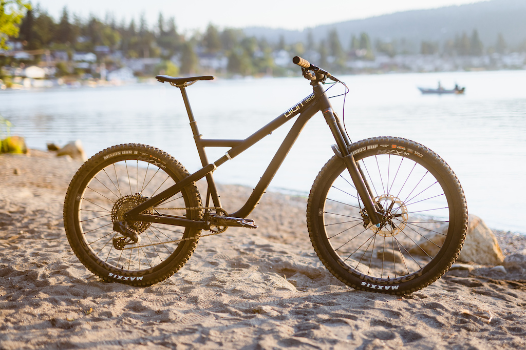
I quite like the look of the Digit Datum...
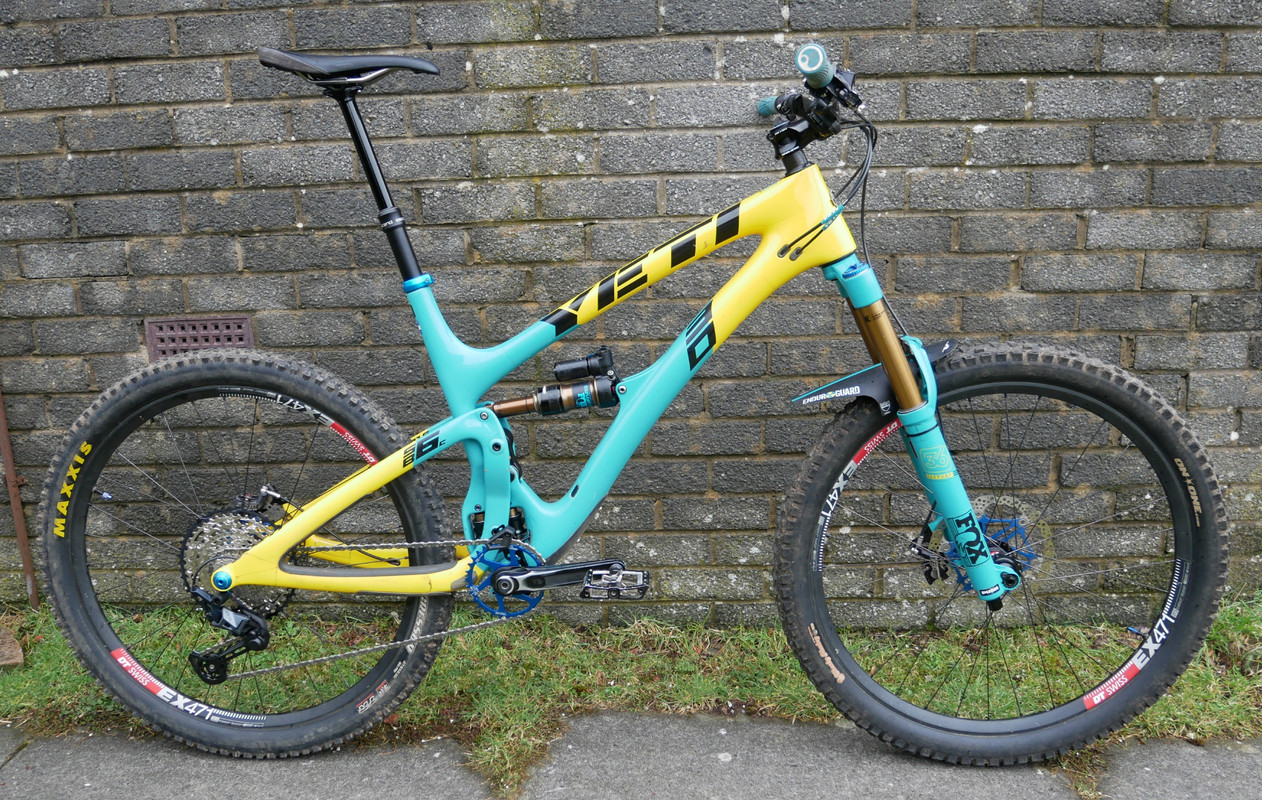
The Yeti would probably look better if it didn't seem to be about two sizes too small for the rider. Also looks like it suffers from the Santa Cruz large margarine tub head tube which makes the fork and stem look odd. Why do they do that?
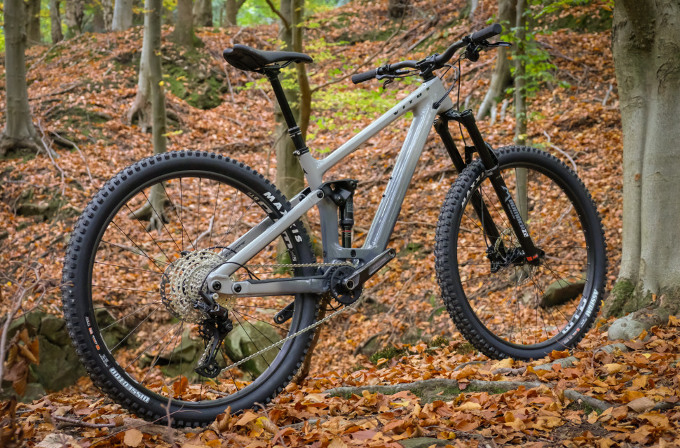
Most Vitus FS look pretty rancid but that one above looks decent in that picture. The Digit suffers from the down tube to bottom bracket curse.
The Birds seem to range from okay looking to not okay looking. They must ride well because they are not lookers.
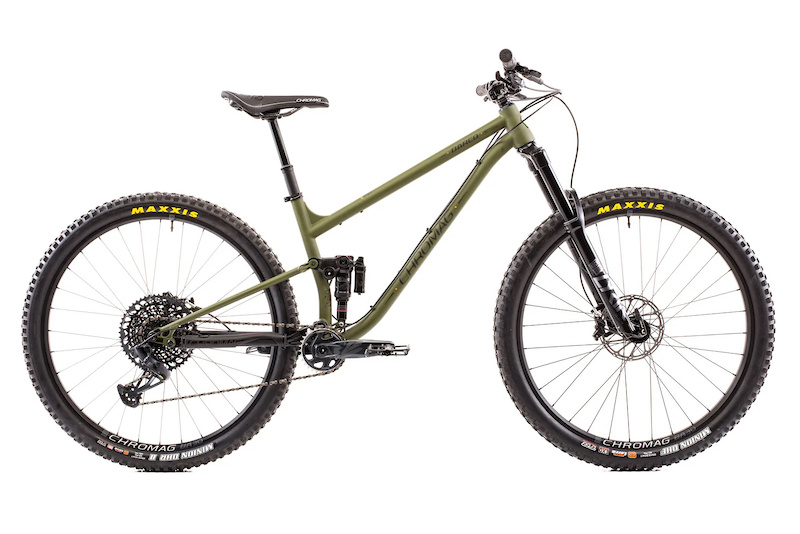
The pink Transition makes me want a Transition more. They're the clear winners of this thread.
Chromag Darco looks great too.
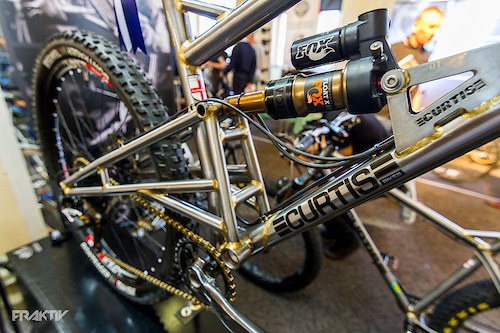
Curtis
Is that to show how far away the other end of the spectrum is? ^^
that orange looks like homer simpson designed it
No-one, I think - apart from me, earlier in the thread - has talked about frame size and how it impacts on aesthetics. Mostly, I'd say, the larger the frame size, the more horrendous it tends to look as the visual ratio between the wheels and the frame shifts and frame tends to look more and more ungainly.
This is bad news for tall people and, in particular, my mate who owns an XXL (or something) Geometron, which is possibly the ugliest bike ever made and a triumph of function over fashion, or at least visual acceptability. I've lost count of the number of bikes posted on this forum where an ostensibly attractive build is rendered hideous because the owner is unfortunate enough to be six foot something.
You can see it sometimes on brand websites where the same bike looks okay/ugly/surprisingly attractive depending on which size frame the pack shot it using. Conversely really small frame can also look oddly cramped and compressed, particularly when you have 29" wheels.
I don't know what size frame designers work on for prototyping and how they take into account scaling up or down - ideally I guess you'd change the wheels in proportion to the frame, but I can't see that one happening just yet.
Anyway, this, I quite like because I probably shouldn't./..<br />
At the risk of sounding a bit naff, I do think it's healthy that opinions vary so widely on what makes an attractive frame.
The sport would be a lot more dull if every bike really did look like a Session.
The only thing we all seem to agree on is Transitions looks good (though I also wouldn't get one because of the pricing and the questionable QC).
(though I also wouldn’t get one because of the pricing and the questionable QC)
Oooh, à l'orange? Pray tell.
Is that to show how far away the other end of the spectrum is? ^^
Nah, it's just Sharkattack trolling another thread for some reason?
No-one, I think – apart from me, earlier in the thread – has talked about frame size and how it impacts on aesthetics.
It always has. I'm a retro biker but my collection is almost unrideable as I buy 17-19" bikes that are too small for me. XL/21" frames with 26" wheels always look terrible!
29" wheels and LLS geometry have improved things but designers still seem to use medium/large as their template, which obviously makes sense.
At the risk of sounding a bit naff, I do think it’s healthy that opinions vary so widely on what makes an attractive frame.
Well ultimately it's a purely subjective judgement, there is no objective measure of what makes a frame or bike visually attractive. What's mildly amusing is watching people trying to create rules about chain-stays and top-tubes and ratios between, oh I dunno, head-tube length and seat-stay diameter to try and impose some sort of faux order on the whole thing.
You have to think there's an element of cultural familiarity/acceptability here - remember when 29ers were derided as 'wagon wheels', whereas now any bike above XS size with 26" wheels looks faintly odd and even 650b seems slightly wrong. What's changed? Hint: it's not the bike.
I get that it's a bit of a human trait to try to explain the inexplicable - hello religion, hello conspiracy theories - but ultimately we can simply say, there is no hard and fast rule, different people find different things, proportions, shapes, sizes attractive for different reasons. Beyond that you can go down rabbit holes, but actually just accepting that is fine and reasonable.
I mean dear god, I used to ride a Maverick Ml7, widely derided as hideous, and quite liked it, even with the DUC32 fork.
But basically, it's arguably not just 'healthy', it's inevitable, though I guess, in its way, that is healthy, if only because people are prepared to stick their heads above the parapet and declare an undying love for Orange styling 🙂
I loved the look of the Ibis Mojo enough to drop for a HD4 a few years ago, but couldn't afford to buy full price new so wasn't able to get pick a colour and had to settle for an ex-demo in black. Still a beautiful machine though. I've put Ibis decals on the wheels now, in orange to match the Fox forks and matching grips, which has lifted it a bit from nearly full stealth black as it was originally. It's astonishingly capable and I completely love it. I also always loved Orange bikes, from the Clockworks I lusted over as a teen to the full sussers. My highest mileage bike is my daily commuter, the Orange RX9 gravel bike. 🍊❤️

I loved the look of the Ibis Mojo enough to drop for a HD4 a few years ago
See, at the time, I thought these looked ace. Now, not a fan at all
I have an HD3, visually very similar. The bike is faultless, it does everything I ask of it.
But it doesn't speak to me in the same way a pretty bike would.
Not everyone can have great taste 😂
All "modern geometry" mountain bikes look terrible, imo.
Swarf Contour and Transition Spur for me. Basically any full sus, that on first glance, looks like a HT. If it looks like a steel HT it gets bonus points.
Oddly I’m also a fan of the other end of the spectrum. Bikes that look like agricultural equipment, so Orange and Curtis.
I love the look of the Spesh Enduro and the Kenevo SL. To me they just look right.

The Transition does look good though.

^^^no
^^no
^no
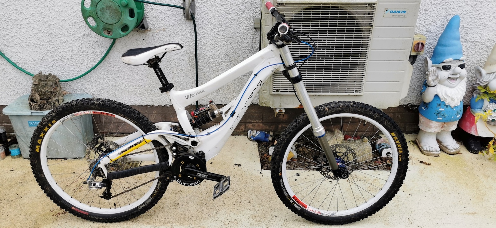
Nice gnomes 😎👍
No e-bikes are pretty either, sorry. Massive tube to house the battery/motor just makes the proportions look all wrong.
Yep, no e-bike has been anything better than average.
My ebike has no aspirations to look pretty. None whatsoever. It just looks like the absolute tank that it is 😂
(It's still better looking than that bloody Orange 🙄 though that hasn't got a battery as an excuse 😉)

The Spur was my choice. 
That Spur's not a total disaster, but it's hardly good looking either. The top tube/seat stay arrangement is pleasing, but what's up with that headtube? Coupled with the really long top tube, it looks like someone's started with a big blob of material and just kept pulling tubes out of it.
(It’s still better looking than that bloody Orange 🙄 though that hasn’t got a battery as an excuse 😉)
Not sure about that tbf.😬
As for the Transition, the head tube is a bit bulbous. Maybe looks worse due to spacers and xc forks? Still much prettier than most though.
^^The gnomes are better looking than that melting bike 🤮🤣
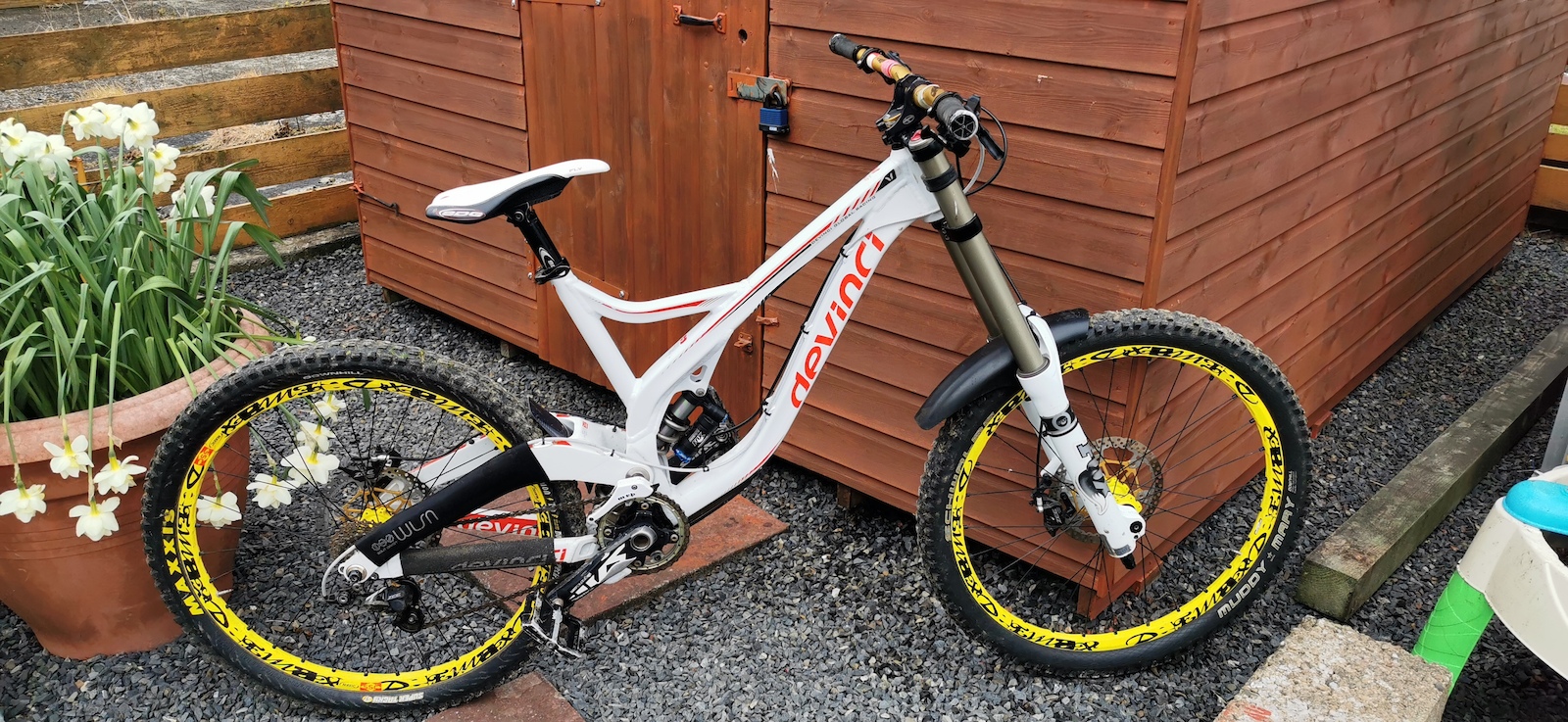
@Daffy ... Spur looks great.
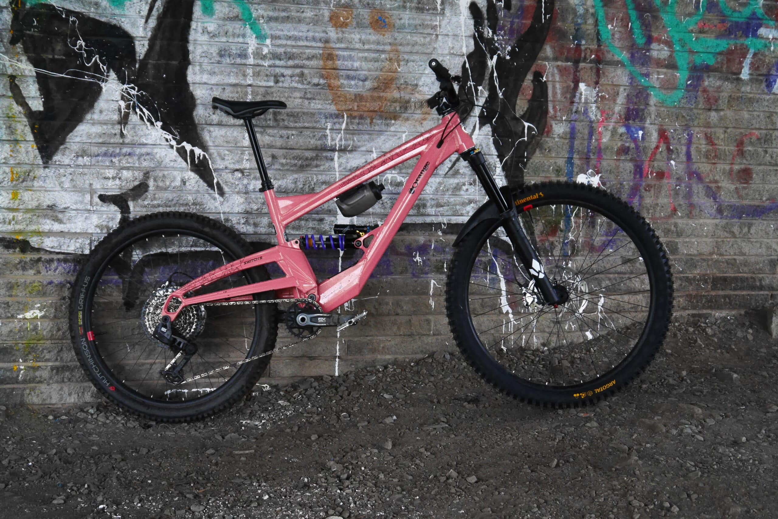
But you lose points for playing it against that monstrous concrete wall.
What about a Liteville 301, always liked the look of these.

What about a Liteville 301, always liked the look of these.
that particular angle of that shot, kinda looks like an AI attempt at a bike. I understand how the lightville suspension works, but I couldnt figure it out from that view, it looks like its missing some bits

Current enduro rig. It still makes me swoon.


@stingmered lovely bike, I've been keeping my out on the 2nd hand market for ages for one to come up in size XL, been plenty of size L sadly. Might have to start looking further afield, beauty of a design.
Very nice. All Propain's FS bikes look great IMO

Looks no worse than most current Santa Cruz. Not sure that’s a good thing though?
Propain shows that carbon bikes with that silhouette don’t have to be minging.
It doesn’t when you are dead side on. Anywhere else you see the mega wide downtube.
My ebike has no aspirations to look pretty. None whatsoever. It just looks like the absolute tank that it is
I have the normally aspirated version of that bike - even down to the colour, and even then it's a tough ask to call it anything other than "robust"
